
Blog Home
Explore expert insights, design trends, and AI-driven color theory. Your essential resource for color excellence.
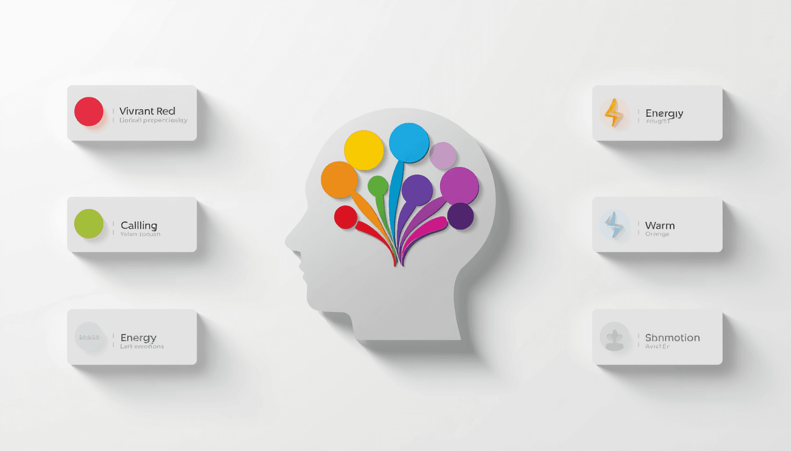
Color Psychology — How Colors Affect Emotion and Design
Before a visitor reads a single word on your website, they have already formed an impression. Before a customer picks up a product, they have already decided whether it feels right. That split-second response is not random — it is color doing its work. Color psychology is the study of how colors influence human perception, emotion, and behavior. It is one of the most research-backed principles in design, marketing, and branding, and yet it remains one of the most underused tools in practice. Understanding it does not just make designs look better — it makes them work harder. This guide covers the full picture: what color psychology is, how individual colors function emotionally, how cultural context shapes interpretation, and how to apply these principles practically in real design work.
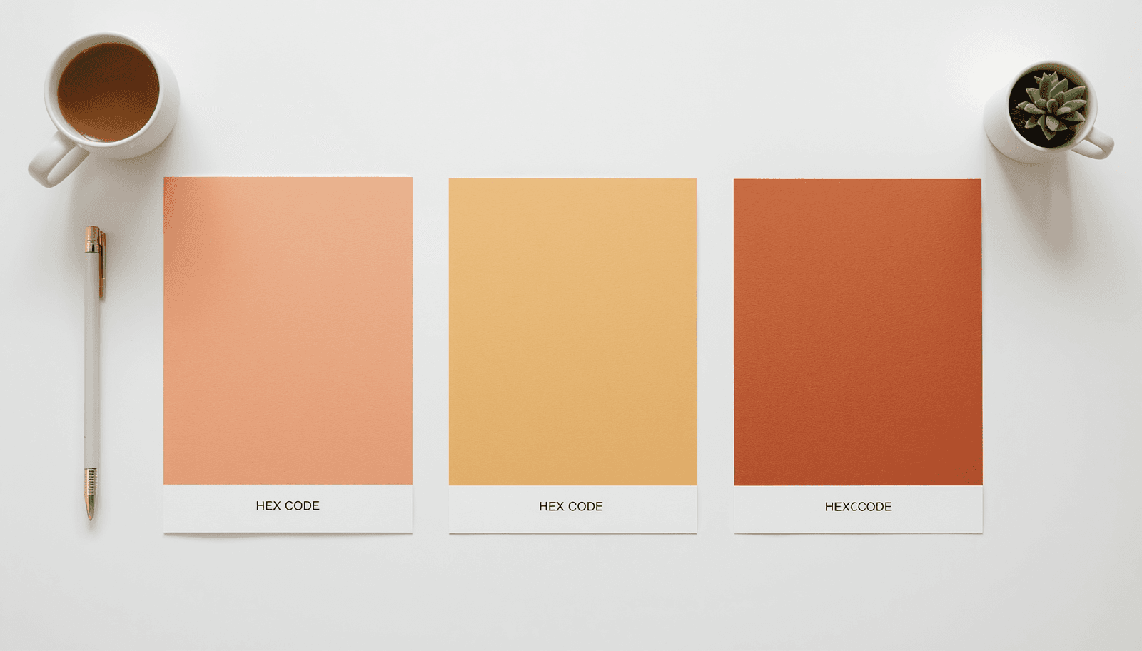
Analogous Colors — Building Harmonious Color Palettes
Some palettes just feel right. You see them in nature, in well-designed interiors, in brand identities that feel effortless. More often than not, those palettes are built on analogous colors — a foundational concept in color theory that designers rely on for creating calm, cohesive, and professional visuals. If you have ever felt that a design looks polished but could not explain why, analogous color harmony is likely the reason.
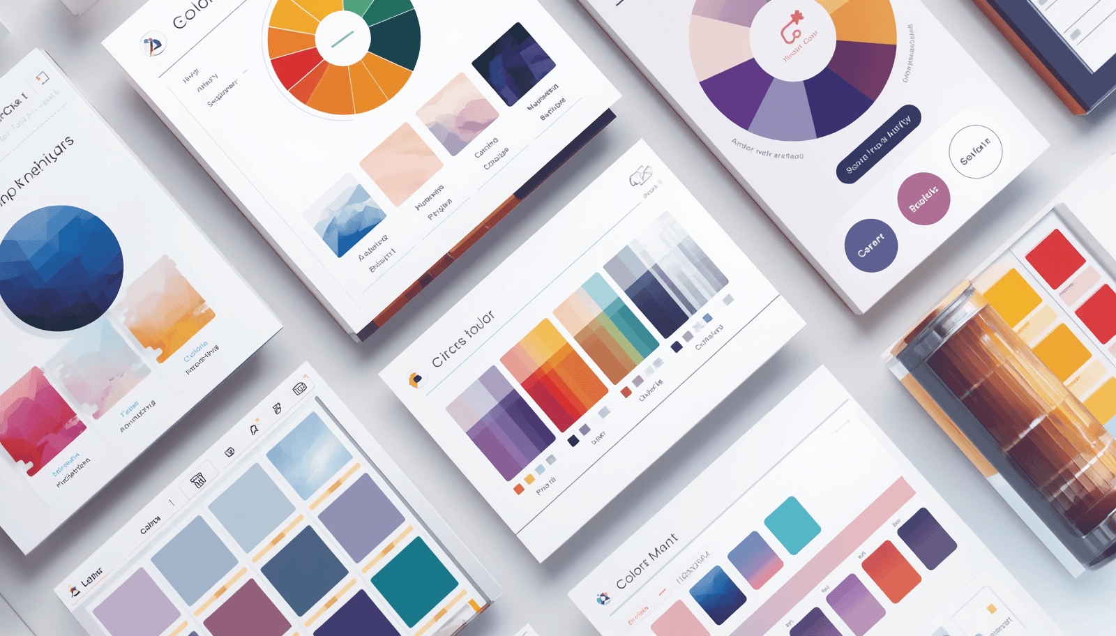
Free Color Palette Generator — Best Free Tools Compared 2026
You open a new design file, stare at the blank canvas, and the first real decision you have to make isn't layout — it's color. That moment of "what goes with what" is exactly why a free color palette generator has quietly become one of the most-opened tabs in any designer's browser. There's no shortage of options in 2026. Adobe Color, Coolors, Paletton, and a handful of newer AI-assisted tools all promise the same thing: fast, harmonious palettes without touching a paid plan. The differences only show up once you've actually used a few of them on real projects, which is what this comparison is built around.
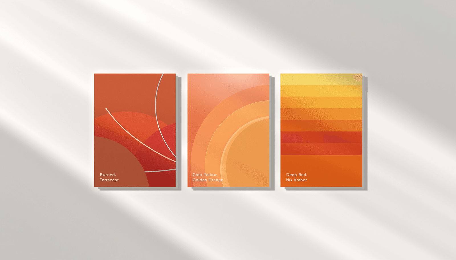
Warm Color Palettes — Reds, Oranges & Yellows That Pop
Walk into a room painted in burnt terracotta or a sunset-orange accent wall, and something shifts immediately. The space feels closer, friendlier, alive. That's the quiet power of warm color palettes — they don't just decorate a space, they change how it feels to be in it. Whether you're designing a brand identity, a living room, or a digital interface, understanding how reds, oranges, and yellows work together can transform a flat design into one that genuinely pops. This guide breaks down everything you need to know about building a warm color scheme that feels intentional, not accidental.
Cool Color Palettes — Blues, Greens & Purples for Any Design
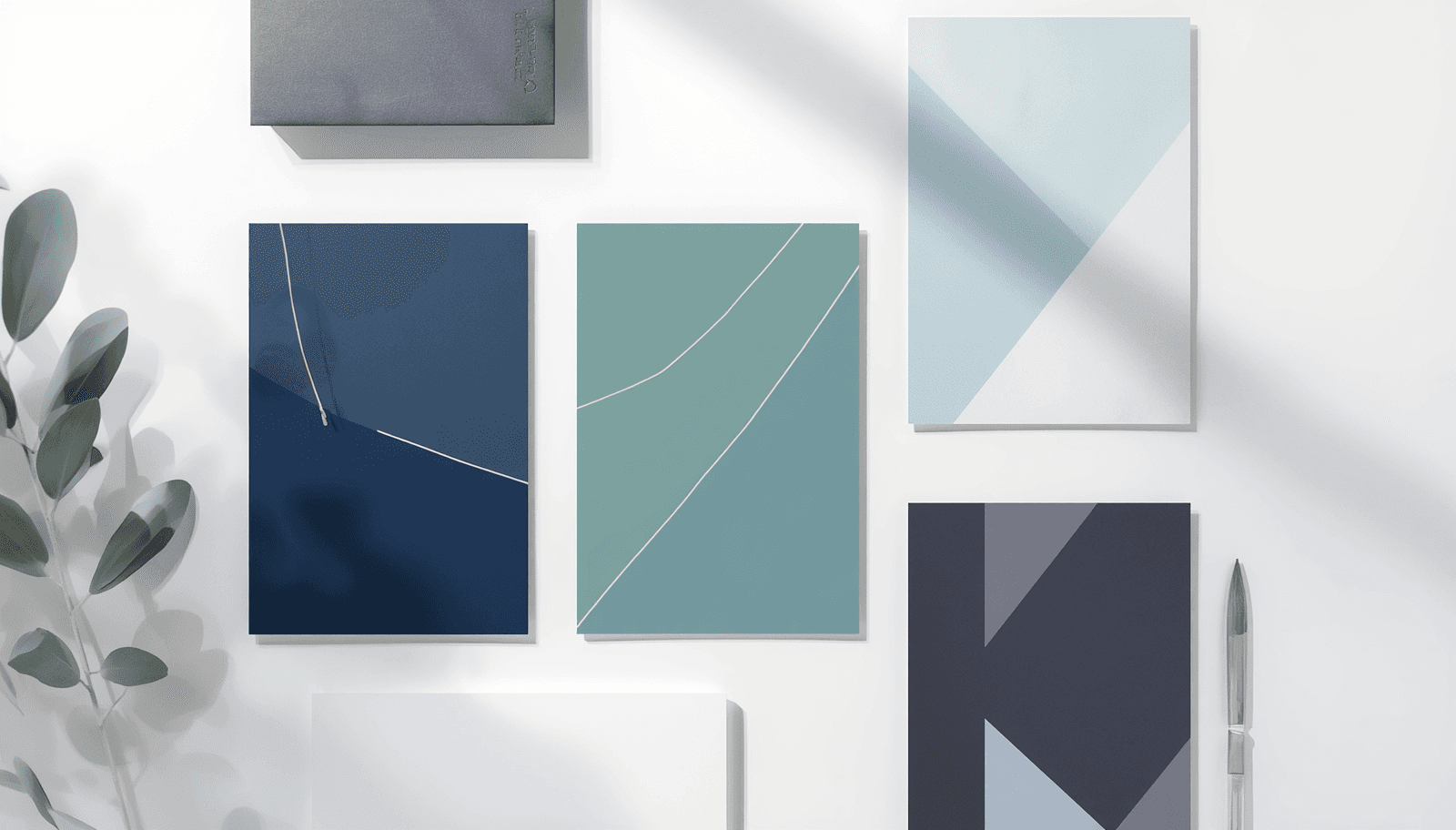
A fintech client once asked us to switch their primary call-to-action button from green to navy blue, mostly on instinct. The result, tracked over the following A/B test period, was a genuine lift in conversions — but the more useful finding wasn't the lift itself, it was why: green felt too casual for a financial decision, and the cooler, more restrained navy communicated the stability the product actually needed to project. That's the honest version of how cool color palettes work — not a universal rule that blue always converts better, but a context-specific match between a color's restrained, lower-arousal quality and a category where calm and credibility matter more than energy or urgency. This guide covers cool color palettes — blues, greens, and purples — with hex codes, the actual research behind why they read as calming and trustworthy, and an honest look at where the popular "blue means trust" claims hold up versus where they're oversimplified.
Monochromatic Color Palette — Single Hue Design Mastery
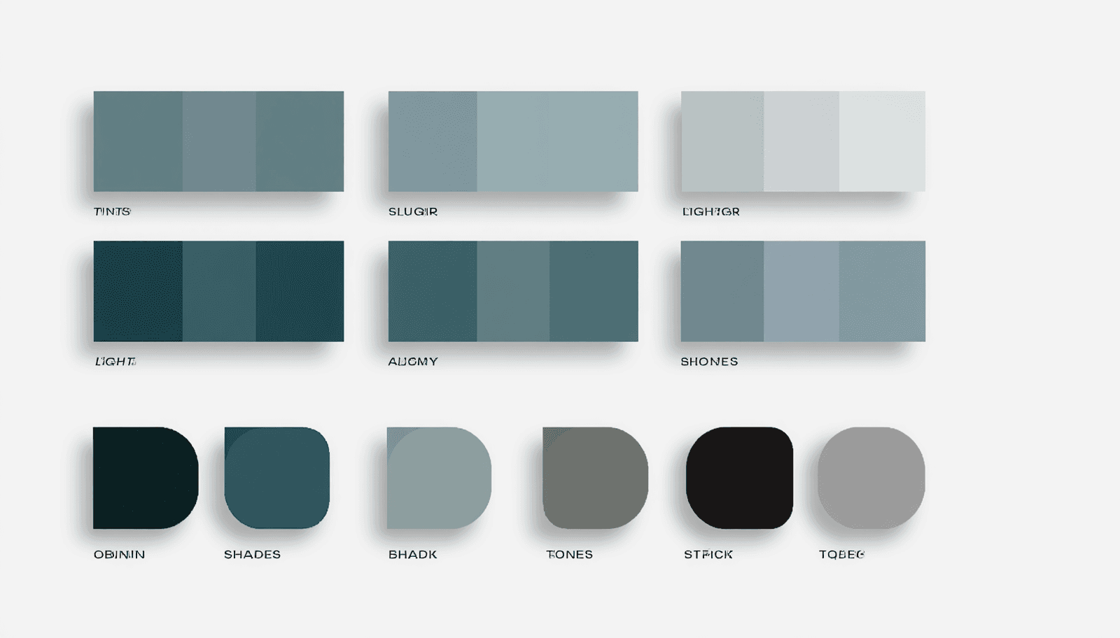
The most common mistake I see in monochromatic design isn't choosing the wrong hue — it's stopping at tints and shades and never touching saturation. A palette built only from lighter and darker versions of one hue can look flat and slightly artificial, like a gradient rather than a considered system. The missing third dimension is tone — the same hue with reduced saturation — and palettes that use all three modifications together read as noticeably more sophisticated than ones using only two. This guide covers what a monochromatic color palette actually is at the technical level, why the three-part tint/shade/tone structure matters more than most quick tutorials explain, and how to apply it in a real design system rather than just a pretty swatch.
Earth Tone Color Palette — Natural & Organic Color Combinations
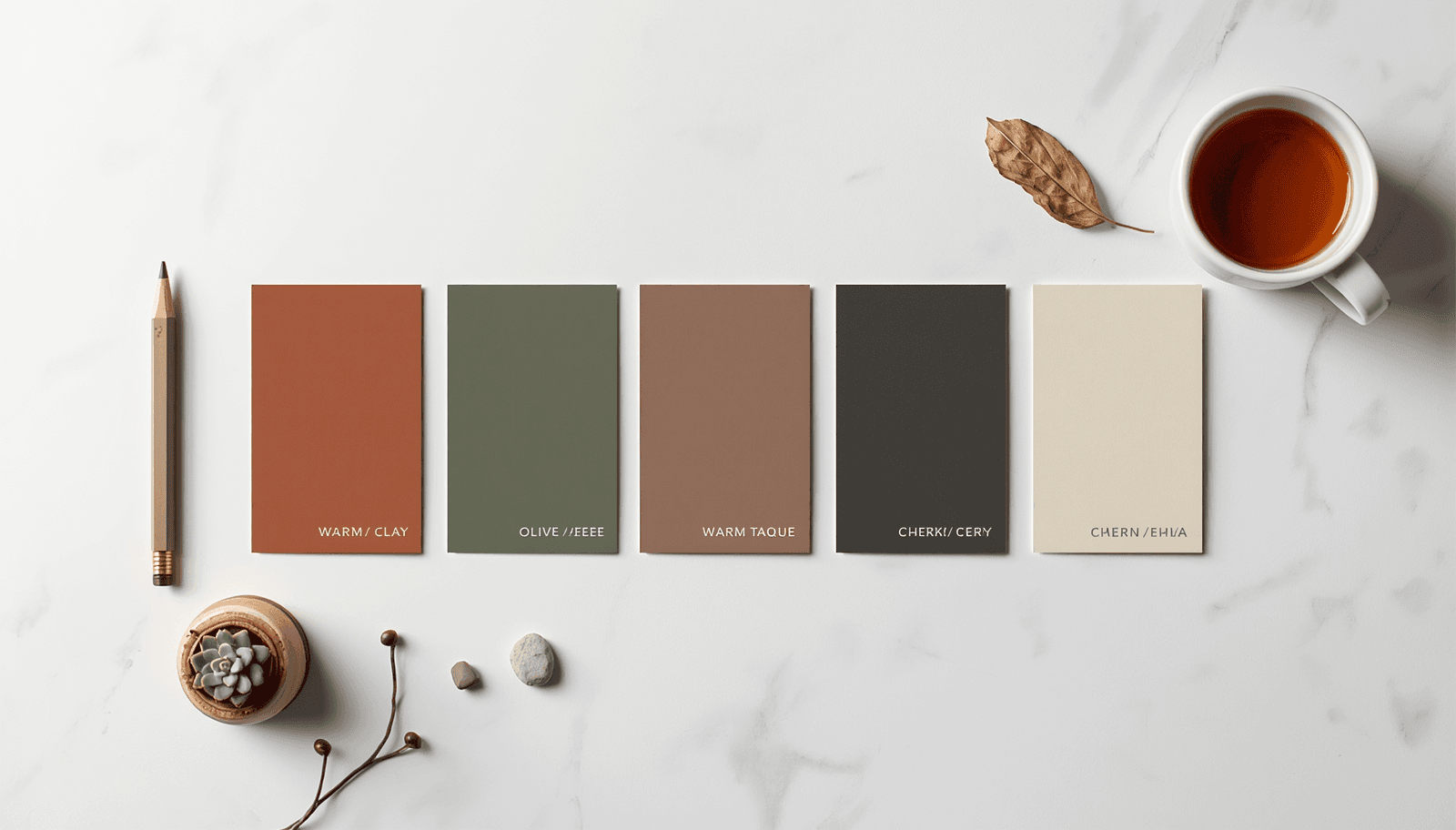
A client asked me last year to make their brand "feel less like a tech company" without changing the actual product. The fix wasn't a new logo or new copy — it was swapping a cool blue-grey palette for warm clay and olive tones. The product didn't change. The perceived warmth of the entire brand did, within a single palette revision. That's the specific power of an earth tone color palette: it shifts perceived character — warmth, honesty, groundedness — more reliably than almost any other color direction, because it borrows credibility directly from materials people already trust. This isn't a passing aesthetic preference. Industry forecasting from multiple major paint and design authorities independently points to earth tones as the dominant direction for 2026, not a single trend call from one source. This guide covers the specific earth tone combinations backed by that forecasting data, with hex codes, real use cases, and the accessibility and production details most "natural color inspiration" content skips.
Neon Color Palette — Bold & Bright Electric Color Schemes
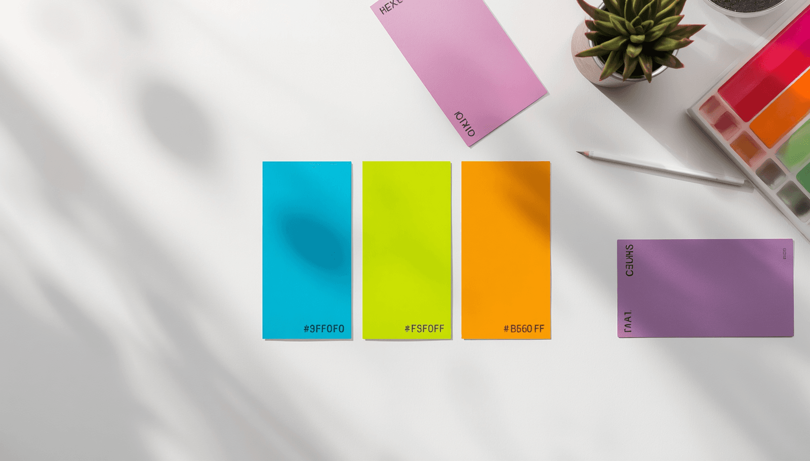
I tried shipping a neon palette across an entire landing page once — every section, full saturation, no restraint — and the client's first feedback call lasted four minutes before they asked us to "make it less like a rave." That failure taught me more about how neon actually works in production than any color theory reading did: neon isn't a palette you apply everywhere, it's a tool you apply somewhere specific, and the entire effect depends on what surrounds it. This guide covers neon color palettes that genuinely work in 2026 design — with hex codes, the specific contexts where neon performs well, and the production limitations (accessibility, print, dark mode dependency) that most "bright color inspiration" roundups skip entirely.
How to Create a Brand Identity with Colors — Step-by-Step
A founder I worked with last year had already paid a freelancer for a logo before we ever discussed color. The logo was solid work — clean mark, good proportions — but it had been delivered in a flat black-and-white file with a note saying "add your brand colors later." That "later" turned into three weeks of indecision, four rejected palette options, and a final color choice driven mostly by exhaustion rather than strategy. The problem wasn't the logo. It was treating color as a finishing touch instead of a foundational decision made alongside everything else. This guide walks through building brand identity colors the way it should actually happen — as a structured process informed by what color genuinely communicates, not a late-stage decoration applied after the "real" branding work is done. It includes the psychology research behind why color choice matters as much as it does, a step-by-step process, and the production details — contrast checking, export formats — that determine whether a palette survives contact with a real website and a real social media manager.
Color Palette for Social Media — What Works on Instagram, TikTok & More
I scrolled through a client's Instagram grid last year and couldn't tell which of three competing posts from the same week belonged to their brand at first glance — the color treatment shifted post to post depending on whoever was editing that day. That's the actual problem this guide solves. Not "what colors are trending," but how to build a social media color palette specific enough to survive contact with three different editors, two platforms with different aspect ratios, and an algorithm that increasingly rewards exactly the kind of repetition most creative teams instinctively resist. The stakes here are larger than they look. Industry research on brand color consistency consistently puts the recognition lift from a consistently applied palette in the range of 80 percent compared to inconsistent color use across touchpoints — a figure that shows up repeatedly across independent marketing research because the underlying mechanism (color as a retrieval cue stored separately from verbal memory) is well established, even if the exact percentage varies by study and methodology. This guide covers how to build that palette, why platform-specific rendering differences mean a palette can look correct in your design tool and wrong in a feed, and how 2026's specific algorithm shifts on Instagram and TikTok change what "consistent" actually needs to mean in practice.
Typography & Color — How to Pair Fonts and Color Palettes
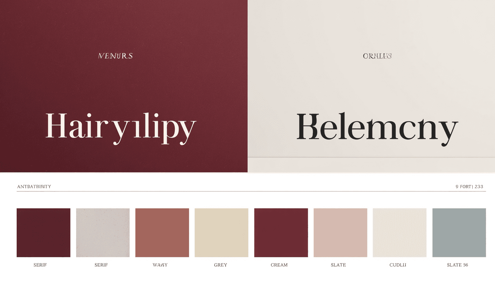
I've spent the last several years building and optimizing color systems and SEO content across multiple live products, including ThemePalette and a portfolio of client web projects. My work spans hands-on palette design, accessibility auditing, and technical implementation in real production codebases — not just theory. This guide reflects choices I've actually shipped, including a few I had to walk back. I once spent two hours picking the "perfect" color palette for a client's editorial site, then dropped their existing serif headline font on top of it and watched the entire thing fall apart. The deep burgundy I'd chosen — which looked rich and confident next to a clean sans-serif in my mockup — turned muddy and hard to read against the same client's heavier, more ornamental serif. The color hadn't changed. The font had — and that was enough to break the whole system. That project is the reason this guide treats color and typography as one decision, not two sequential ones. Most color palette guides stop at the hex codes. Most typography guides stop at font pairing. The actual failure point in real projects is almost always where the two intersect — a color that works fine on a swatch but fails the moment real type, real weight, and real size get applied to it.
Best Color Combinations for Stunning Designs in 2026
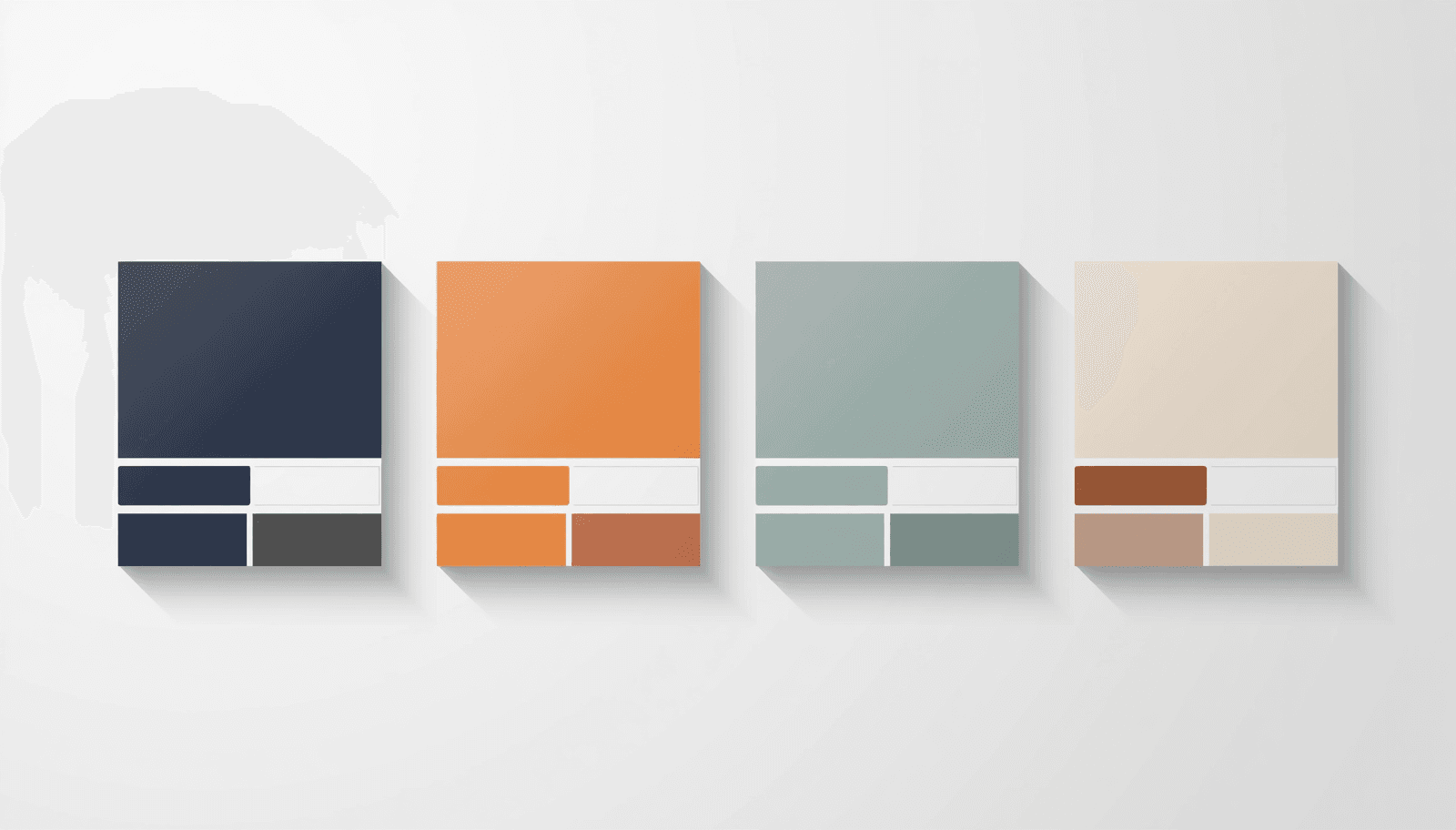
Three months ago I sent a client a navy-and-gold homepage mockup I was genuinely proud of. They came back with one line: "it looks like every law firm website I've ever seen." They weren't wrong. I'd picked the combination because it tested well on a Pinterest moodboard, not because it fit a business that sells skateboards to teenagers. That rejection is the reason this list exists in its current form. Most "best color combinations" roundups are written by scrolling Coolors and copying hex codes that look nice in a 200×200 swatch. They never get tested against an actual logo, an actual nav bar, an actual mobile screen at 375px wide where half the contrast you liked on a 27-inch monitor suddenly disappears. I run color and design work across three live sites — ThemePalette, a separate Next.js content site, and client SEO projects — so the combinations below are pulled from things I've actually shipped, not just admired. Some worked. A couple didn't, and I'll say which ones and why, because a list that only tells you what's good is a list written by something that's never actually had a client reject a mockup.
Vibrant Color Combinations — Bold & Eye-Catching Palettes
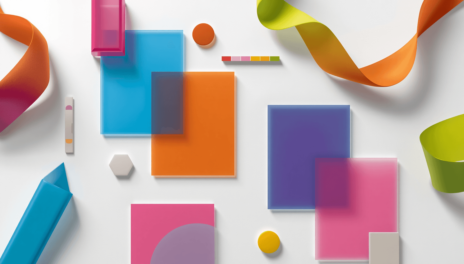
After several years dominated by muted neutrals and quiet, desaturated palettes, bold color is reasserting itself across design in 2026. Industry color forecasts describe this shift directly: after a long period defined by restraint, vibrant hues are returning with confidence — bringing optimism and personality back into visual design, with saturation reframed as expressive rather than overwhelming. This shift is visible across interior design, fashion, and digital interfaces simultaneously. Interior designers report a return to bright, high-contrast pairings — turquoise with chartreuse, pink layered with blue — grounded by crisp whites to keep the overall effect feeling fresh rather than chaotic. In UI design, the trend has taken the form of "hyper-saturated accents" — single, intentional bursts of high-saturation color such as electric blue, neon green, or radiant violet placed within otherwise minimal, restrained layouts. This guide covers the vibrant color combinations working across these contexts in 2026, with hex codes, the color theory mechanics behind each, and guidance on using high-saturation color without overwhelming a design. Generate and test any combination at ThemePalette.

AI Color Palette Generator — Smart Color Schemes in Seconds
The phrase "AI color palette generator" has become common marketing language across design tools, but the underlying mechanism — what the AI is actually doing when it suggests a palette — is rarely explained clearly. Understanding the mechanism matters because it determines how much to trust AI-generated suggestions, when to override them, and how to get better results from the same tool. This guide explains how AI-powered color palette generation actually works, what data these models are trained on, how AI suggestions differ from traditional rule-based color wheel generators, and how to use ThemePalette's smart color generator effectively as part of a real design workflow. Generate AI-assisted palettes directly at ThemePalette — no account required.
Aesthetic Color Palettes — Dreamy & Artistic Color
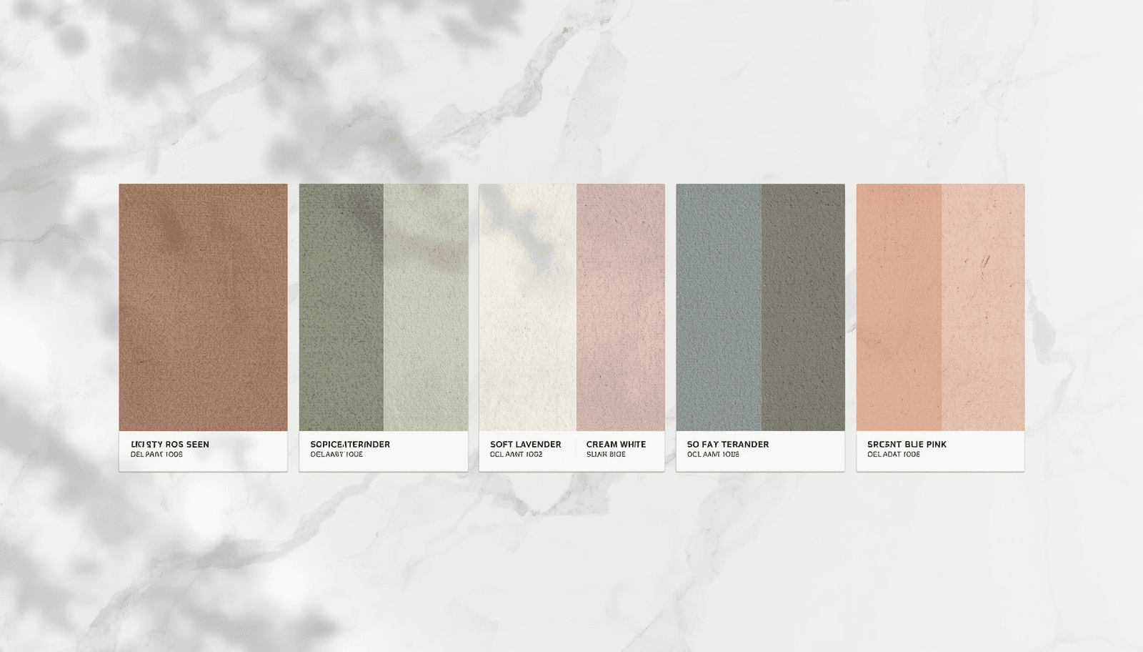
"Aesthetic" has become the dominant organizing concept for visual identity on social media — replacing earlier language like "style" or "theme" — because it describes something more precise: a cohesive sensory world defined by specific color, texture, and mood relationships. A well-constructed aesthetic color palette does not just look pleasant; it communicates an entire emotional register instantly. Research published in the Journal of Business Research (Babin, Hardesty & Suter, 2003) established that color is the primary driver of initial product and brand perception, with studies consistently finding that 62 to 90 percent of a viewer's first-impression assessment is based on color alone. In social media contexts where content is evaluated in under two seconds during a scroll, this compression of judgment is even more pronounced. Choosing the right aesthetic color palette is not a decorative decision — it is a communication decision. This guide documents the most significant aesthetic directions in color in 2026, each grounded in specific color theory principles, with hex codes and use cases. All palettes can be generated and exported for free at ThemePalette.
Coolors Color Palette Generator vs ThemePalette Comparison
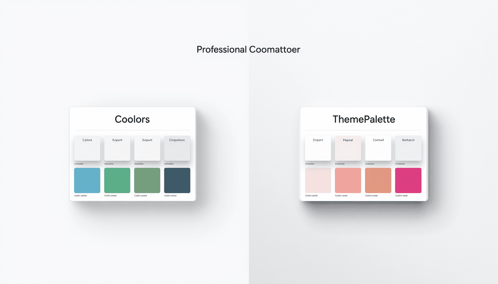
Coolors is one of the most widely used color palette tools on the internet. Since its launch in 2015 by Fabrizio Ciulla, it has accumulated over 5 million registered users and become a default reference point for designers looking to generate color palettes quickly. For many designers, it was the first palette generator they ever used. ThemePalette is a newer entrant to the same space, built with a different set of priorities: no account requirement, full CSS export without a paywall, and a built-in contrast checker that operates during palette generation rather than as a separate tool. The two products overlap significantly in core function but diverge in meaningful ways depending on how a designer actually works. This comparison examines both tools across the dimensions that matter most in daily design practice — feature availability, export options, accessibility tooling, pricing, and workflow integration — based on direct use of both products. The goal is to give designers enough information to choose correctly for their specific context rather than defaulting to whichever tool they encountered first.
Spring Color Palettes — Fresh & Floral Color Schemes for 2026
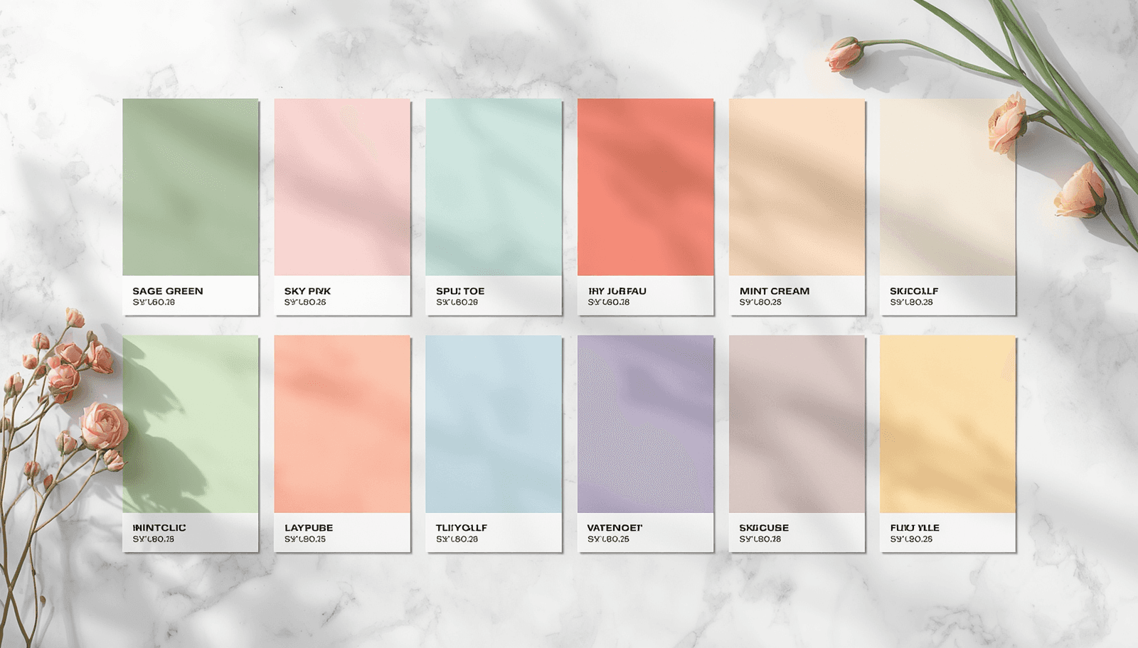
Spring color is not simply a matter of using light, bright, or floral hues. It is a specific emotional register — freshness, renewal, lightness after a period of visual heaviness — that operates through particular relationships between color temperature, saturation, and value. Designers who understand what makes spring palettes work can apply that logic precisely rather than reaching for the nearest pastel. This guide documents the spring color palettes that are performing in design work in 2026, organized by visual character and use case. Each palette includes hex codes, the color theory logic behind it, and specific contexts where it applies. All palettes can be generated, customized, and exported at ThemePalette.
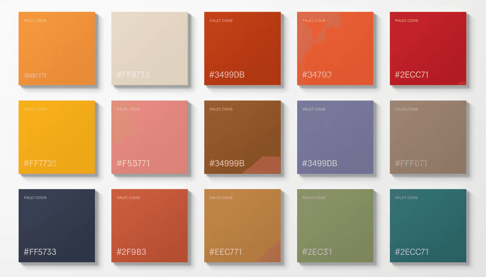
Color Palettes with Hex Codes — Ready to Copy & Use
Every design project eventually reaches the same moment: you need an exact color value to pass to a developer, drop into CSS, or enter into a design tool. Hex codes are the universal language of digital color. A six-character string prefixed with # encodes a precise RGB color value that renders identically across browsers, operating systems, and design applications — no ambiguity, no interpretation required.
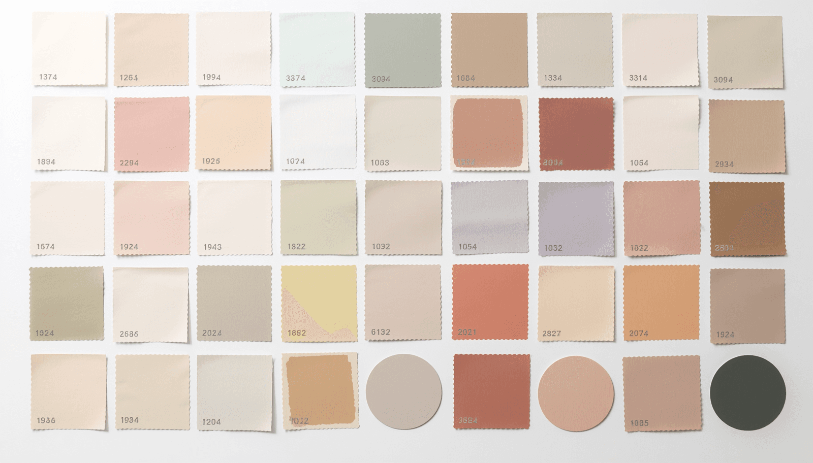
Pretty Color Palettes — 50 Beautiful Color Combinations
Not every design project calls for bold contrast or high-energy color. A significant portion of visual work — personal branding, lifestyle content, beauty and wellness, editorial design, social media graphics — is better served by palettes that feel soft, considered, and genuinely pleasant to look at. The word "pretty" in design is often used dismissively, but it describes something precise: color combinations that are harmonious, approachable, and visually gentle without being weak or forgettable.
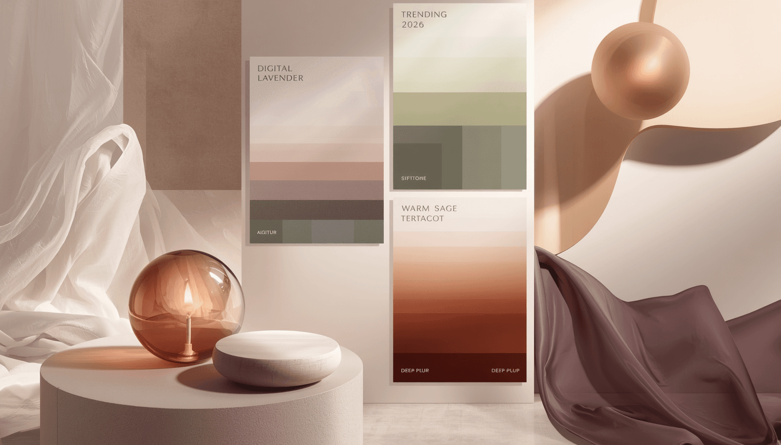
Trending Color Palettes 2026 — What Designers Are Using Now
Color trends in design do not emerge arbitrarily. They reflect shifts in cultural mood, material availability, technological capability, and the visual language being established by the most visible products and brands at a given moment. Understanding why a color palette is trending matters as much as knowing which palettes are trending — it determines whether a trend is worth adopting for a specific project or likely to age poorly within twelve months.
Color Palette Generator — Free Online Tool
Every design project starts with the same problem: you need colors that work together, fit the mood you are going for, and hold up across every application from a small icon to a full-screen hero section. Finding those colors used to mean hours of trial and error. A good color palette generator cuts that process down to minutes.
Pastel Color Palettes
In the world of design, color sets the tone, evokes emotion, and guides user interaction. Among the most versatile and visually soothing options are pastel color palettes. Whether you are designing websites, user interfaces, or branding materials, pastels offer a unique way to engage audiences worldwide. In this all-encompassing Theme Palette guide, we are going to cover everything you need to know about pastel color palettes ranging from how they are made and selected through their application and optimization.