Color trends in design do not emerge arbitrarily. They reflect shifts in cultural mood, material availability, technological capability, and the visual language being established by the most visible products and brands at a given moment. Understanding why a color palette is trending matters as much as knowing which palettes are trending — it determines whether a trend is worth adopting for a specific project or likely to age poorly within twelve months.
This article documents the trending color palettes 2026 that are appearing consistently across web design, brand identity, packaging, and digital product design. Each palette is presented with hex codes, the design context in which it is gaining adoption, and the reasoning behind its emergence. These are palettes currently in active use — not predictions or speculation.
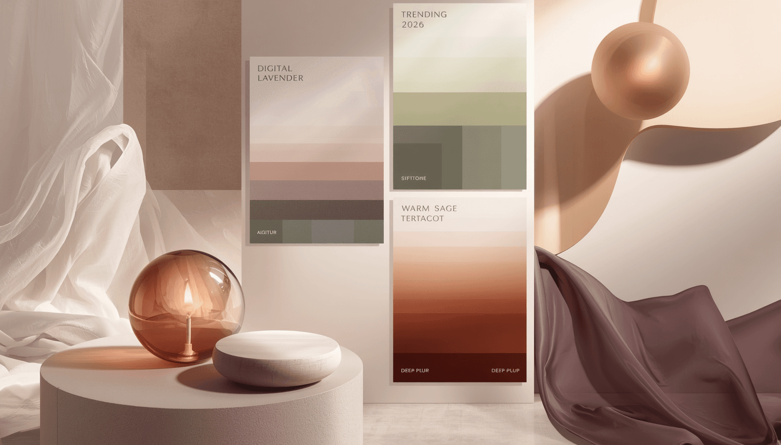
To generate and test any of these palettes in your own projects, use ThemePalette's free palette generator or browse the full palette collection to see how these combinations apply across real UI contexts.
Why Color Trends Shift: The Underlying Forces
Before examining specific palettes, it helps to understand the forces that push trending colors 2026 into mainstream adoption.
Cultural reaction cycles: Design trends frequently operate as reactions to what preceded them. The maximalist, bright, dopamine-heavy color choices that dominated 2022 and 2023 UI design are giving way in 2026 to more considered, restrained palettes. This is a recurring pattern: high-energy visual periods are followed by quieter, more grounded aesthetic moments.
Pantone and material color systems: Pantone's annual Color of the Year influences purchasing decisions across print, fashion, and interiors industries. Those shifts propagate into digital design within twelve to eighteen months as designers working across disciplines bring material-world color language into screen-based work.
Platform and tool defaults: The default color palettes in widely used design tools — Figma community files, Tailwind CSS's default palette, Material Design 3's dynamic color system — shape what large numbers of designers reach for first. When a tool's defaults shift, the visual landscape shifts with them.
AI product proliferation: The visual branding of AI-native products in 2025 and 2026 has established a particular color language — deep purples, electric blues, gradient-heavy palettes — that is now being adopted and reacted to simultaneously across the design community.
Trending Color Palettes 2026
1. Warm Minimalism: Bone, Sand, and Charcoal
Hex codes: #F2EDE4 / #C8B49A / #2E2E2E
This three-color palette represents the clearest expression of the 2026 trend away from stark black-and-white minimalism toward warmer, more tactile neutrals. Bone and sand replace pure white and light grey as background and secondary surface colors. Charcoal replaces black as the primary text and UI element color.
The shift is subtle in individual components but significant at the page or product level: warm neutrals introduce a sense of physical material — paper, linen, unfinished concrete — that cold whites do not.
Where it is appearing: Independent brand websites, editorial, high-end e-commerce, architecture firms
2. Digital Botanical: Deep Forest, Moss, and Cream
Hex codes: #1E3A2F / #5C7A5A / #FAF3E0
Nature-derived color palettes are not new, but the 2026 version of botanical color is darker and more saturated than the soft sage-and-white aesthetic that dominated 2022–2024. Deep forest green signals permanence and environmental authority rather than the passing wellness trend that lighter greens often communicate.
This palette is gaining significant adoption among brands making sustainability claims — the darker, richer green communicates that the commitment is substantive rather than decorative.
Where it is appearing: Sustainability brands, organic food, premium beverage, environmental organizations
3. Tech Violet: Deep Purple, Soft Lavender, and Off-White
Hex codes: #3B1F6E / #B8A9D9 / #F8F6FF
This is the signature palette of the AI product wave. Deep purple as a primary brand color has been adopted by a significant number of AI-native startups since 2024, to the point where it has become a recognizable visual shorthand for the category. In 2026, it remains one of the hot color palettes in technology branding while beginning to spread beyond AI into creative tools, wellness technology, and premium consumer apps.
Where it is appearing: AI products, creative software, wellness tech, premium consumer apps
4. Warm Industrial: Rust, Raw Linen, and Iron Grey
Hex codes: #B5451B / #EDE0CE / #4A4A4A
Rust orange — a deeply muted, warm version of orange derived from oxidized iron — is one of the defining accent colors of 2026. Unlike terracotta, which carries softer artisan associations, rust reads as tougher and more industrial. Combined with raw linen as a base and iron grey as a secondary neutral, this palette communicates durability, craft, and physical materiality.
This combination is appearing in menswear-adjacent brand identities, independent food and beverage brands positioning themselves against large corporate competitors, and trade and skilled-work adjacent businesses (construction, manufacturing, logistics) that want to modernize their visual language without losing the credibility of their physical industry.
Where it is appearing: Craft food and beverage, menswear, trade industries, independent retail
5. Quiet Luxury: Champagne, Warm Taupe, and Graphite
Hex codes: #E8D5B0 / #8C7B6B / #3D3D3D
The "quiet luxury" aesthetic that emerged in fashion in 2023 and 2024 has fully arrived in digital design in 2026. This palette deliberately avoids any color that reads as loud, attention-seeking, or trend-driven. Champagne, warm taupe, and graphite are all colors that have been present in premium design contexts for decades — which is precisely the point. The palette signals that the brand does not need to try.
This is one of the most effective popular color schemes for high-ticket e-commerce, premium hospitality, financial services targeting affluent clients, and luxury real estate. The absence of any bright or saturated color is itself a design statement.
Where it is appearing: Luxury e-commerce, premium hospitality, wealth management, real estate
6. Retro Digital: Electric Teal, Warm Cream, and Deep Navy
Hex codes: #00B4A6 / #FFF8E7 / #0D1B2A
There is a significant movement in 2026 toward color palettes that reference the early internet and personal computing era — the CRT monitor greens, the bright teals, the warm cream of aged paper. This palette takes that reference and filters it through contemporary restraint: the teal is vibrant but not neon, the cream is warm but not yellow, the navy is deep but not black.
The result is a palette that feels both nostalgic and current — a quality that is particularly effective for brands targeting millennial audiences who have both a genuine memory of that era and the cultural distance to find it visually interesting rather than dated.
Where it is appearing: Indie software products, creative agencies, gaming, design tools, media brands
7. Muted Coastal: Soft Blue-Grey, Driftwood, and Pale Sand
Hex codes: #7B9BAD / #A08C78 / #EDE8DF
Coastal color palettes have existed as a design trend for years, but 2026 versions are significantly more restrained than the bright turquoise-and-white combinations traditionally associated with the category. Soft blue-grey — desaturated enough to read almost as a neutral — paired with driftwood brown and pale sand produces a palette that feels calm and unhurried without being generic.
This palette is performing strongly in travel and hospitality, residential real estate, and lifestyle brands targeting audiences who associate quality with understatement. It also works well in long-form editorial contexts where the palette needs to stay in the background rather than compete with content.
Where it is appearing: Travel and hospitality, residential real estate, lifestyle media, wellness retreats
How to Apply These Trends Without Dating Your Design
Trend-aware design requires judgment about which elements to adopt and at what intensity. Three practical principles:
Use trending palettes at the accent level, not the foundation level. If rust orange is trending and you use it as your entire brand color, you are building a brand that will look dated when the trend passes. If you use it as a single accent color in an otherwise neutral system, the palette can be updated without rebuilding the entire visual identity.
Test trending palettes against your specific audience. A palette that resonates with design-literate audiences in 2026 may not land with audiences who are less embedded in current visual culture. A color combination can be simultaneously on-trend and wrong for a given project.
Generate variations before committing. Use ThemePalette's color palette generator to explore multiple tonal variations of a trending palette. The specific hex codes documented here are starting points — adjusting lightness and saturation by 10–15% in either direction can move a palette from trend-following to genuinely distinctive.
For broader color design tool options that support this kind of exploration, Coloraccy offers spectrum-based color exploration tools, and Coloraccy Spectrum is particularly useful for visualizing how a color behaves across its full tonal range before locking it into a palette.
See also: Pastel Color Palettes Guide for a deeper look at the soft, muted end of the 2026 color spectrum.
Conclusion
The trending color palettes 2026 share a common thread: they are more considered, more restrained, and more materially grounded than the palettes that dominated the previous two to three years. Warmth, craft, and understatement are the defining qualities across multiple trend directions — from warm minimalism to quiet luxury to warm industrial.
Understanding the cultural logic behind these trends is as useful as knowing the hex codes themselves.
Generate, test, and preview any of these palettes at ThemePalette.com.