Every design project eventually reaches the same moment: you need an exact color value to pass to a developer, drop into CSS, or enter into a design tool. Hex codes are the universal language of digital color. A six-character string prefixed with # encodes a precise RGB color value that renders identically across browsers, operating systems, and design applications — no ambiguity, no interpretation required.
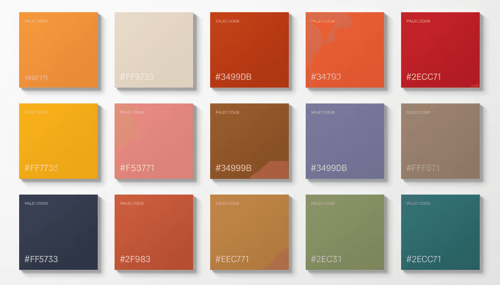
This resource guide provides color palettes with hex codes organized by mood and use case, ready to copy and use directly. Every palette includes all hex values and a brief note on where it performs best. All palettes can also be generated, customized, and exported in multiple formats at ThemePalette.
What Is a Hex Code and How Does It Work?
A hex code is a six-digit hexadecimal number that represents the red, green, and blue (RGB) components of a color. The format is #RRGGBB, where:
RR = red channel value from 00 (none) to FF (maximum)
GG = green channel value from 00 to FF
BB = blue channel value from 00 to FF
Each two-character pair is a hexadecimal number, meaning it uses base-16 notation (0–9 plus A–F). The value FF in hexadecimal equals 255 in decimal, which is the maximum intensity for any single RGB channel.
Some practical examples:
Hex Code | Red | Green | Blue | Color |
#FF0000 | 255 | 0 | 0 | Pure red |
#0000FF | 0 | 0 | 255 | Pure blue |
#FFFFFF | 255 | 255 | 255 | White |
#000000 | 0 | 0 | 0 | Black |
#C46F4B | 196 | 111 | 75 | Terracotta |
This encoding system was standardized for use in HTML in the early 1990s and remains the dominant color notation format in web development, CSS, SVG, and most design tools. When a developer receives a hex code, they know exactly which color to render — no conversion step required.
Hex codes can also be written in shorthand when each pair of characters is identical: #FFFFFF becomes #FFF, #000000 becomes #000. However, the six-character format is recommended for clarity and universal compatibility.
How to Use Hex Codes in Different Contexts
CSS and Web Development
/* Background color */
body {
background-color: #F5F0E8;
}
/* Text color */
h1 {
color: #1A1A1A;
}
/* CSS Custom Properties (recommended for design systems) */
:root {
--color-primary: #2D5A27;
--color-surface: #FAF4E0;
--color-accent: #C46F4B;
--color-text: #1A1A1A;
--color-text-secondary: #6B7280;
}
Using CSS custom properties rather than hardcoded hex values throughout a stylesheet means a palette can be updated by changing five lines in one location rather than finding and replacing every instance across the codebase.
Figma and Sketch
In Figma, select any shape or text element, open the Fill panel, and type the hex code directly into the color input field. The # prefix is optional in Figma's input — both C46F4B and #C46F4B work. Figma also supports saving colors to a local style library, which is the recommended approach for any project using a consistent palette across multiple frames.
Tailwind CSS
If your project uses Tailwind, add custom colors to tailwind.config.js:
module.exports = {
theme: {
extend: {
colors: {
'brand-primary': '#2D5A27',
'brand-surface': '#FAF4E0',
'brand-accent': '#C46F4B',
}
}
}
}
This makes the hex values available as utility classes (bg-brand-primary, text-brand-accent) throughout the project.
Canva and Other Design Tools
Canva accepts hex codes in the color picker under "Custom color." Click any color swatch, select the hex input field at the bottom of the picker, and type the code. Canva also allows saving brand colors to a palette for reuse across designs — useful for maintaining consistency across social media templates.
Ready-to-Use Color Palettes with Hex Codes
Each palette below is listed with all hex values and a recommended role assignment. Copy paste hex colors directly into your project.
Professional and Corporate
Corporate Trust
Primary: #1B3A6B (Deep navy — backgrounds, headers)
Secondary: #2E6DA4 (Mid blue — interactive elements)
Accent: #C9A84C (Warm gold — highlights, CTAs)
Surface: #F8F9FA (Near white — page background)
Text: #1A1A2E (Near black — body copy)
Executive Minimal
Primary: #0D1B2A (Midnight — primary brand color)
Secondary: #A8B4C0 (Silver — secondary elements)
Accent: #E8D5B0 (Champagne — accent details)
Surface: #FFFFFF (White — backgrounds)
Text: #1A1A1A (Charcoal — body text)
Finance Green
Primary: #1A3C34 (Deep teal-green — authority)
Secondary: #2E6B5A (Mid green — secondary surfaces)
Accent: #4CAF50 (Active green — positive indicators)
Surface: #F4F7F5 (Pale green-white — background)
Text: #1A2520 (Dark green-black — text)
Creative and Portfolio
Bold Creative
Primary: #FF6B6B (Coral — hero sections, CTAs)
Secondary: #1A1A1A (Warm black — backgrounds)
Accent: #FFE66D (Yellow — highlight details)
Surface: #2A2A2A (Dark grey — card backgrounds)
Text: #F8F8F8 (Off white — body text on dark)
Studio Neutral
Primary: #2E2E2E (Charcoal — primary elements)
Secondary: #8C8C8C (Medium grey — secondary text)
Accent: #E8C87A (Warm gold — selective highlights)
Surface: #F5F0E8 (Bone — page background)
Text: #1A1A1A (Near black — body copy)
Ink and Paper
Primary: #1C1C1E (Ink black — dominant UI color)
Secondary: #48484A (Graphite — secondary elements)
Accent: #FF9F0A (Amber — interactive highlights)
Surface: #F2F2F7 (System grey — backgrounds)
Text: #1C1C1E (Ink — body copy)
Wellness and Lifestyle
Organic Calm
Primary: #3D6B4F (Forest green — brand color)
Secondary: #7FAF8A (Sage — secondary surfaces)
Accent: #C46F4B (Terracotta — warm accent)
Surface: #FAF6EC (Warm cream — page background)
Text: #2A2A20 (Dark warm — body copy)
Spa Minimal
Primary: #6B9E9E (Dusty teal — primary brand)
Secondary: #A8C8C4 (Pale teal — secondary surfaces)
Accent: #E8D5B0 (Sand — warm accent)
Surface: #F8F6F2 (Off white — backgrounds)
Text: #2E3C3C (Dark teal — body text)
Warm Wellness
Primary: #8FAF8B (Sage — primary color)
Secondary: #C8A870 (Warm tan — secondary)
Accent: #E87878 (Muted coral — CTA accent)
Surface: #F5F0E8 (Linen — page background)
Text: #2A2A1E (Dark warm — body copy)
E-Commerce and Retail
Premium Shop
Primary: #1A1A1A (Near black — strong anchoring)
Secondary: #4A4A4A (Dark grey — secondary text)
Accent: #C9A84C (Gold — price highlights, CTAs)
Surface: #FAFAFA (Near white — product backgrounds)
Text: #1A1A1A (Near black — product copy)
Fresh Market
Primary: #2E7D32 (Market green — brand identity)
Secondary: #81C784 (Light green — secondary elements)
Accent: #FF8F00 (Amber — sale badges, CTAs)
Surface: #FFFFFF (White — product cards)
Text: #1B2E1C (Dark green — body copy)
Artisan Shop
Primary: #C46F4B (Terracotta — brand personality)
Secondary: #A85C38 (Deep terracotta — hover states)
Accent: #2D5A27 (Forest green — complementary)
Surface: #FAF4E0 (Warm cream — backgrounds)
Text: #2A1E14 (Dark warm brown — body copy)
Technology and SaaS
Developer Dark
Primary: #0D1117 (GitHub black — dark backgrounds)
Secondary: #161B22 (Dark surface — card backgrounds)
Accent: #58A6FF (Electric blue — interactive elements)
Surface: #21262D (Elevated surface — panels)
Text: #C9D1D9 (Muted white — body copy)
SaaS Blue
Primary: #0057FF (Electric blue — brand color)
Secondary: #0041CC (Deep blue — hover states)
Accent: #00C7B7 (Teal — secondary CTA)
Surface: #F8FAFF (Blue-tinted white — background)
Text: #0D1B2A (Navy — body copy)
AI Purple
Primary: #3B1F6E (Deep purple — brand identity)
Secondary: #5A3490 (Mid purple — interactive elements)
Accent: #B8A9D9 (Lavender — soft highlights)
Surface: #F8F6FF (Purple-tinted white — background)
Text: #1A0E38 (Dark purple — body copy)
Editorial and Publishing
Magazine Neutral
Primary: #1A1A1A (Near black — headlines)
Secondary: #6B7280 (Slate — secondary text, captions)
Accent: #DC2626 (Editorial red — pull quotes, highlights)
Surface: #FFFFFF (White — article background)
Text: #374151 (Dark grey — body copy)
Literary Warm
Primary: #2C1810 (Dark brown — primary brand)
Secondary: #8C6840 (Sepia — secondary elements)
Accent: #C9A84C (Aged gold — decorative details)
Surface: #FDF8F0 (Aged paper — page background)
Text: #2C1810 (Dark brown — body copy)
Social Media and Content Creation
Creator Aesthetic
Primary: #E8B4B8 (Dusty rose — brand color)
Secondary: #C49898 (Deep rose — hover states)
Accent: #F8E8C0 (Butter — warm highlight)
Surface: #FDF8F5 (Warm white — backgrounds)
Text: #3A2A28 (Warm dark — captions)
Bold Content
Primary: #FF6B35 (Vivid orange — hero color)
Secondary: #1A1A1A (Near black — grounding)
Accent: #FFE135 (Vivid yellow — accent details)
Surface: #FAFAFA (Near white — card backgrounds)
Text: #1A1A1A (Near black — body copy)
Generating Your Own Hex Code Palettes
The palettes above are starting points. Most projects require some adjustment — a slightly warmer surface color, a more muted accent, a darker text shade to pass accessibility contrast requirements.
ThemePalette's free generator lets you:
Enter any hex code as a locked starting color
Generate harmonious palettes around it automatically
Adjust individual colors with a full color picker
Export the complete palette as CSS custom properties, JSON, or a PNG image for client presentations
The palette preview tool shows your palette applied across real UI components — navigation, cards, buttons, forms — before you commit to it in a project.
Trending Color Palettes 2026 documents what is in active adoption across web and brand design this year.
Accessibility: Checking Hex Code Contrast Ratios
A hex code palette that passes visual inspection may still fail accessibility requirements. The Web Content Accessibility Guidelines (WCAG) 2.1 Level AA standard requires:
4.5:1 minimum contrast ratio for normal body text (under 18pt or 14pt bold)
3:1 minimum contrast ratio for large text (18pt+ or 14pt+ bold)
3:1 minimum contrast ratio for interactive UI components and graphical elements that convey meaning
Contrast ratio is calculated from the relative luminance of two colors — a value derived from the RGB components of each hex code. The formula, defined in WCAG 2.1 Success Criterion 1.4.3, uses a linearized version of the RGB values (accounting for gamma correction) to produce a luminance value between 0 and 1 for each color. The contrast ratio is then expressed as (L1 + 0.05) / (L2 + 0.05) where L1 is the lighter color's luminance and L2 is the darker color's luminance.
In practical terms: dark text on a light background is almost always safe. The combinations that frequently fail are mid-tone colors placed against each other — a medium grey text on a light grey background, or a muted blue on a white surface that looks fine on a calibrated monitor but fails on lower-quality screens.
Check every text-on-background hex pair in your palette before finalizing. The W3C maintains a publicly available contrast ratio checker as part of the WCAG documentation, and ThemePalette includes contrast checking as part of the palette generation workflow.
Conclusion
Hex codes are the foundation of digital color work. Every color decision made in a design tool, brand guideline, or style system eventually resolves to a six-character value that tells a browser, operating system, or printer exactly which color to render. Having a library of color palettes with hex codes organized by context and use case removes the friction from the most time-consuming part of early design work.
The palettes in this guide are ready to copy and use. For any project that requires customization beyond what is listed here — adjusted tones, additional shades, or export to CSS or JSON — ThemePalette's free generator handles the full workflow in the browser with no account required.