The most common mistake I see in monochromatic design isn't choosing the wrong hue — it's stopping at tints and shades and never touching saturation. A palette built only from lighter and darker versions of one hue can look flat and slightly artificial, like a gradient rather than a considered system. The missing third dimension is tone — the same hue with reduced saturation — and palettes that use all three modifications together read as noticeably more sophisticated than ones using only two.
This guide covers what a monochromatic color palette actually is at the technical level, why the three-part tint/shade/tone structure matters more than most quick tutorials explain, and how to apply it in a real design system rather than just a pretty swatch.
What "Monochromatic" Actually Means, Precisely
A monochromatic color scheme uses a single hue and varies only its lightness and saturation to build the rest of the palette. In HSL (Hue, Saturation, Lightness) terms, this means the Hue (H) value stays completely fixed across every color in the palette — only the Saturation (S) and Lightness (L) values change.
This single constraint is what makes monochromatic palettes inherently cohesive: every color in the system shares the exact same parent hue, so there is no possibility of hue clash, the kind of visual conflict that happens when two colors with different underlying hues compete for attention.
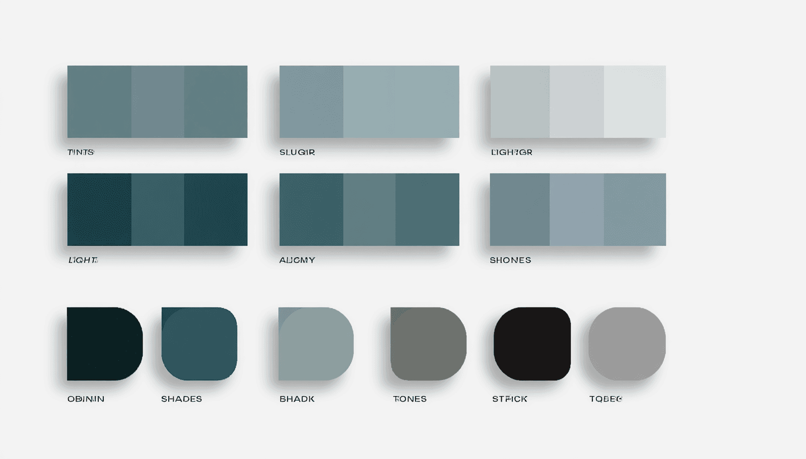
The Three Modifications: Tints, Shades, and Tones
This is the part most quick guides compress into a single sentence, and it's the actual technical foundation that determines whether a monochromatic palette looks rich or flat.
Tints: Hue Plus White (Higher Lightness)
A tint is created by adding white to the base hue — in HSL terms, increasing the Lightness value while keeping Hue fixed. Tints become progressively lighter and, as a side effect, less visually intense. Pastel colors are tints. In UI design specifically, tints are commonly used for backgrounds, hover states, and disabled or inactive elements, precisely because their lower visual weight signals "background" or "less important" without introducing an unrelated color.
Shades: Hue Plus Black (Lower Lightness)
A shade is created by adding black — decreasing the Lightness value. Shades become darker and read as more serious, dramatic, and grounded than their parent hue. In a design system, shades function as anchor points: the darkest values in the palette, used for text, headers, pressed button states, and primary interface elements where visual weight and authority matter.
Tones: Hue Plus Gray (Reduced Saturation)
This is the modification most beginner guides skip or under-explain, and it's the one that adds genuine depth to a monochromatic system. A tone is created by adding gray — which in HSL terms means decreasing Saturation without necessarily changing Lightness at all. The result is a muted, desaturated version of the hue that isn't simply "lighter" or "darker" — it's quieter. Dusty rose is a tone of red. Sage green is a tone of green..
The actual technical insight: a monochromatic palette built only from tints and shades (varying only Lightness) can look like a simple gradient. Adding tones (varying Saturation independently) is what gives the palette the sense of having genuinely different colors within the same family, rather than just different brightness levels of one color.
Building a Monochromatic Palette: A Working Process
Step 1: Choose Your Base Hue Deliberately
This is the single most consequential decision in a monochromatic system, because every other color in the palette inherits this hue's emotional territory. Green carries sustainability and growth associations. Blue carries trust and calm. Deep purple carries creativity and a sense of the premium or unusual. Since a monochromatic system can't lean on a second color to balance or complicate that signal, the base hue choice needs to align precisely with what the brand or project is trying to communicate.
Step 2: Generate a 5-7 Stop Ramp
Technically, there are infinite possible stops between the lightest tint and darkest shade of any hue. In practice, functional monochromatic systems typically settle on five to seven defined stops. Fewer than three doesn't provide enough range to establish real visual hierarchy. More than eight tends to create selection paralysis for whoever is applying the palette and produces inconsistent usage across a team, since the differences between adjacent stops become too subtle to apply predictably.
A typical five-step ramp keeps Hue constant and steps Lightness through values like 95%, 75%, 50%, 30%, and 15% — moving from a near-white tint through the pure mid-tone hue down to a near-black shade.
Step 3: Assign Roles Using the 60-30-10 Structure
The 60-30-10 proportion rule — a dominant color covering roughly 60% of visual space, a secondary color covering 30%, and an accent covering 10% — applies within a monochromatic system just as it does in multi-hue palettes. The difference is that all three roles are filled by different stops on the same hue's ramp rather than three unrelated colors: a light tint as the dominant background color, a mid-tone as the secondary supporting color, and a dark shade (or the pure base hue itself) as the accent reserved for emphasis and interactive elements.
Step 4: Verify Contrast Across the Full Ramp
Monochromatic systems need particular attention to contrast because it's easy to accidentally pair two stops that are visually distinct in isolation but too close in actual lightness value to meet accessibility standards once placed as text against background. Check every text-on-background combination your design will actually use against the WCAG 2.1 minimum of 4.5:1 for normal text — pairing your lightest tint against your darkest shade is the safest combination; pairing two adjacent mid-tone stops is the riskiest.
ThemePalette's generator displays contrast ratios as part of palette creation, which is useful specifically for monochromatic systems where the visual similarity between stops can make contrast failures easy to miss without an explicit check.
Where Monochromatic Palettes Work Best
Editorial and content-heavy design. A monochromatic system removes the risk of color clash between headlines, body copy, and captions entirely, relying on value contrast (light versus dark) for hierarchy instead. This is part of why it's a common professional default for text-heavy publishing and long-form content work.
Premium and minimal brand identities. A single-hue system, executed with a genuinely full range of tints, shades, and tones, reads as restrained and confident rather than limited — closer to what's described in current interior and brand design coverage as a "quiet luxury" register, where the discipline of sticking to one hue is itself part of the sophistication signal.
Dashboards and data-dense interfaces. Because every element shares the same hue, a monochromatic UI system makes deviations — a single accent color introduced for a specific alert or warning state — far more noticeable and effective than they would be in a multi-hue interface where everything is already competing for visual attention.
Common Failure Points
Lightness range too narrow. If the lightest tint and darkest shade sit too close together, the entire palette reads as flat and the cohesion that monochromatic design is supposed to deliver instead looks like a lack of effort. The fix is straightforward: push the range further in both directions before worrying about adding more intermediate stops.
Skipping tones entirely. A palette using only tints and shades — varying Lightness alone while leaving Saturation untouched — produces a visual gradient rather than a genuinely rich single-hue system. This is the single most common technical gap I see in monochromatic palettes that look "almost right" but slightly off.
Forgetting white space. Monochromatic palettes, by definition, offer less inherent visual variety than multi-hue systems. Generous white space becomes more structurally important here than in a busier, multi-color design, since it's doing some of the visual-interest work that color variation would otherwise provide
Conclusion
A genuinely strong monochromatic color palette depends on using all three available modifications — tints, shades, and tones — not just the two (tints and shades) that most quick tutorials cover. The technical discipline of keeping Hue constant while deliberately varying both Saturation and Lightness is what separates a flat, gradient-like single-color palette from one that reads as rich, intentional, and genuinely sophisticated.
Generate and test your own monochromatic ramp, with contrast ratios checked in real time, at ThemePalette.com.