Not every design project calls for bold contrast or high-energy color. A significant portion of visual work — personal branding, lifestyle content, beauty and wellness, editorial design, social media graphics — is better served by palettes that feel soft, considered, and genuinely pleasant to look at. The word "pretty" in design is often used dismissively, but it describes something precise: color combinations that are harmonious, approachable, and visually gentle without being weak or forgettable.
This guide documents 50 pretty color palettes organized by mood and use case, each with hex codes and a brief note on where it works best. All palettes can be generated, previewed, and exported for free at ThemePalette.
What Makes a Color Palette "Pretty"?
The term is subjective, but there are consistent structural qualities behind palettes that most people describe as pretty or beautiful:
Low to medium saturation: Fully saturated colors at maximum intensity read as bold or aggressive rather than soft. Pretty palettes typically operate in the 30–70% saturation range, where colors feel rich but not overwhelming.
Close value relationships: Colors in pretty palettes tend to sit within a relatively narrow lightness range. The contrast between the lightest and darkest colors is moderate rather than extreme — enough for visual interest, not so much that the palette feels harsh.
Warm or neutral undertones: Cool, high-contrast combinations tend toward clinical or dramatic associations. Warm undertones — slight yellow, pink, or peach shifts in neutrals — introduce approachability.
Analogous or monochromatic harmony: The most reliably pretty palettes use colors that share a hue family or sit adjacent on the color wheel. This produces natural coherence without requiring the viewer to reconcile competing color energies.
Research in environmental psychology, including studies published in the journal Color Research and Application, has consistently found that low-saturation, warm-toned color environments are rated as more pleasant and restful by participants across multiple cultures — supporting what designers have observed empirically for decades.
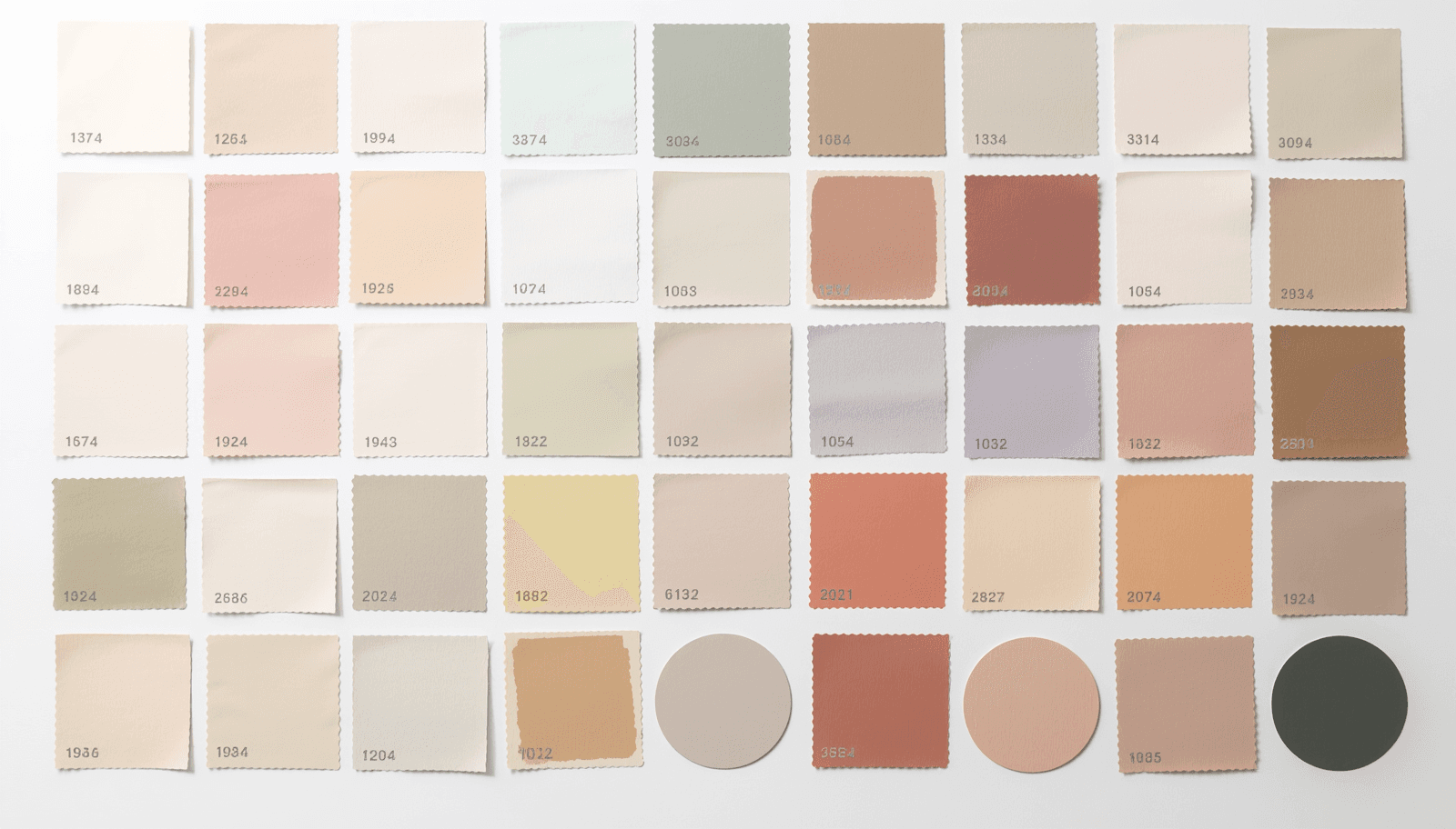
50 Pretty Color Palettes with Hex Codes
Soft and Romantic
1. Blush and Ivory #F2C4CE / #FFF8F0 / #D4A5A5 The pairing of soft blush with warm ivory is one of the most reliable combinations in beauty and wedding design. Neither color competes for attention.
2. Rose Mist and Cream #E8B4B8 / #FDF6F0 / #C49A9A A slightly deeper blush with a warmer cream base. Works particularly well for skincare packaging and feminine personal branding.
3. Dusty Pink and Antique White #D4A5A5 / #FAF0E6 / #B8860B Adding a warm gold accent to muted pink moves the palette from soft to sophisticated.
4. Petal and Linen #F7C5CC / #FAF0DC / #E8A598 Three warm tones in a tight analogous range. Useful for editorial headers and lifestyle blog design.
5. Mauve and Pearl #C9A0B4 / #F8F4F0 / #A07890 Mauve — a grey-pink — sits at the intersection of romantic and restrained. Paired with pearl, it reads as quietly luxurious. Browse the Pearl Palette collection on ThemePalette for ready-to-use variations.
Soft Pastels
6. Baby Blue and Soft White #B8D4E8 / #F5F9FC / #8CB4D0 A monochromatic blue palette at very low saturation. Clean and calm without feeling cold.
7. Lavender and Cream #C8B8E8 / #FDF8F0 / #A898C8 Lavender at this lightness level reads as gentle rather than bold. Pairs naturally with warm cream.
8. Mint and Vanilla #B8E4D8 / #FFF8E8 / #98C8B8 A fresh, light combination that works for health, food, and lifestyle brands wanting something soft but not pink.
9. Peach and Cream #F4C4A0 / #FFF8F0 / #E8A880 Peach is one of the most universally liked colors in human preference research. Its warmth and softness make it highly adaptable.
10. Soft Lilac and Off-White #D4C0E0 / #FAF8FC / #B8A8C8 Lilac — purple at low saturation and high lightness — carries associations with creativity and calm simultaneously.
11. Butter Yellow and White #F8E8B0 / #FFFDF5 / #E8D490 Butter yellow avoids the aggressiveness of saturated yellow while retaining warmth. Excellent for food and bakery contexts.
12. Sage and Linen #B8C8B0 / #F5F0E8 / #98A890 The 2022–2024 dominant aesthetic pairing. Still strong in wellness and lifestyle contexts where familiarity is an asset.
13. Powder Blue and Pearl #C0D4E8 / #F8F4F0 / #A0B8D0 A cool-leaning palette that retains softness through low saturation. Works well for medical and professional service brands that need approachability.
14. Blush and Sage #F0C0B8 / #B8C8B0 / #E0A898 Pink and green are complementary, but at this saturation level the contrast is gentle rather than vivid. A reliable lifestyle palette.
15. Apricot and Cream #F4C090 / #FFF6EC / #E8A870 Warmer than peach, cooler than orange. Apricot has strong associations with warmth, optimism, and hospitality.
Aesthetic and Muted
16. Dusty Rose and Slate #C9968A / #6B7280 / #F0E8E4 A sophisticated pairing that has moved from trend to reliable workhorse. The grey grounds the pink and prevents it from reading as too soft.
17. Terracotta and Cream #C46F4B / #FDF6E3 / #A85C38 Earthy and warm. One of the strongest gorgeous color combinations for artisan, food, and interior brands.
18. Muted Coral and Sand #E8907A / #E8D8C0 / #C87860 Coral pulled toward terracotta through desaturation. The sand base keeps it grounded.
19. Warm Taupe and Ivory #C4A882 / #FDF8F0 / #A88C68 An extremely versatile neutral palette. Works in virtually any professional context without risk.
20. Dusty Teal and Off-White #7AA8A8 / #F5F2EC / #5A8888 Teal at reduced saturation reads as sophisticated and calm — a useful alternative to sage for brands that want something cooler.
21. Mushroom and Cream #C0A898 / #FAF6F0 / #A08878 Mushroom — a warm, grey-brown — is one of the defining neutrals of 2026 quiet luxury aesthetics.
22. Clay and Linen #C87850 / #F2EAD8 / #A85E38 A warm, handmade-feeling palette suited to craft brands, pottery, and independent retail.
23. Greige and Stone #C4B8A8 / #E8E0D4 / #A09080 Greige (grey-beige) palettes are the foundational color language of understated luxury.
24. Warm Blush and Taupe #E8B8A8 / #C4A882 / #F8EEE4 Both colors share warm undertones, creating a cohesive palette that feels harmonious at a larger scale.
25. Faded Denim and Cream #8898B0 / #FAF6F0 / #6880A0 Desaturated blue as a primary with cream creates a relaxed, approachable palette popular in lifestyle and travel content.
Nature-Inspired
26. Forest and Cream #3A5C3A / #FAF4E4 / #2A4428 Deep forest green against warm cream creates a premium, grounded aesthetic without trending toward wellness cliché.
27. Moss and Sand #7A8C60 / #E8D8B8 / #5A6C48 Moss green at medium saturation pairs naturally with warm sand for a genuinely outdoors-inspired palette.
28. Dusty Olive and Cream #8C9060 / #FDF6E4 / #6C7048 Olive — a yellow-green with strong brown undertones — is one of the most reliably sophisticated nature-derived colors.
29. Lavender and Sage #C8B8E8 / #98A888 / #F0ECFC Two analogous colors on the cool-warm boundary. Used extensively in wellness and beauty in 2025–2026.
30. Soft Sky and Dune #A8C4D8 / #D8C8A8 / #88A8C0 A coastal palette at muted saturation. The sky-blue and warm dune-beige create natural complementary tension without harshness.
31. Willow and Cream #A8C0A0 / #FAF4E8 / #88A080 Willow green is softer than sage and carries fewer trend associations — useful for brands that want nature-derived color without the 2022 wellness aesthetic.
32. Stone and Copper #B0A098 / #B87050 / #D0C8C0 A warm-neutral palette with a single warm-metal accent. Appears frequently in premium interior design and architecture branding.
33. Eucalyptus and Ivory #90B0A8 / #FDF8F0 / #708890 Eucalyptus — a blue-tinged green — is softer and more unusual than sage. Relevant to medical, dental, and spa brands.
34. Desert Rose and Warm Grey #C89090 / #B0A8A0 / #F0E8E4 A palette that operates entirely in the muted, warm register. Nothing competes; everything coheres.
35. Lilac and Soft Mint #C8B0D8 / #A8D4C4 / #F8F4FC Two pastels that share light value but differ in hue. Works for beauty, stationery, and children's products.
Cute and Playful (Still Refined)
36. Cotton Candy and White #F4C8D8 / #FFFFFF / #E8A8C0 High-lightness pink against white. The palette reads as playful but not juvenile when used at scale.
37. Peach and Mint #F4C0A0 / #A8D8C8 / #FFF8F0 Warm and cool pastels in a complementary relationship. Soft enough to avoid visual conflict.
38. Lemon and Soft White #F8E8A0 / #FFFDF5 / #E8D480 Butter lemon at high lightness reads as cheerful without aggression. A natural fit for bakery and food content.
39. Sky Blue and Peach #A8C8E0 / #F4C0A0 / #F8F8FC Cool and warm pastels in balance. Widely used in lifestyle social media and fashion editorial.
40. Strawberry Milk and Cream #F0C0C8 / #FFF0E8 / #E0A0A8 A variation on blush that introduces more pink saturation. One of the most consistently popular cute palettes in social media design.
41. Lilac and Butter #D0B8E8 / #F8F0A8 / #F8F4FC Purple and yellow are complementary colors; at this lightness level, the contrast is gentle and sweet rather than bold.
42. Powder Pink and Sky #F0C8D0 / #C0D8F0 / #FAFAFE Analogous at high lightness. Clean and airy.
43. Mint Chip and Cream #90D4B8 / #FFF8E8 / #70B898 A mint with enough saturation to read clearly, paired with warm cream to prevent it from feeling clinical.
44. Candyfloss and Lavender #F4B8D0 / #C8B8E8 / #FAF0FC Two pastel analogous colors from the pink-purple range. A natural pairing for beauty and personal care.
45. Watermelon and Cream #E87880 / #FFF6F0 / #C85860 The most saturated palette in this section. Watermelon is bright enough to create focal points while remaining pleasant rather than harsh.
Neutral and Timeless
46. Bone and Warm Grey #F0E8D8 / #B8B0A8 / #FAF6EE One of the foundational palettes of 2026 warm minimalism. Nothing here will date quickly.
47. Cream and Charcoal #FDF6E4 / #3A3A3A / #F0E8D0 A simple two-tone palette with a warm cream base replacing white. More inviting than black-on-white without losing clarity.
48. Aged Parchment and Sepia #E8D8B8 / #8C6840 / #F8F0DC A warm, historical palette suited to heritage brands, publishing, and editorial work. See the Aged Palette on ThemePalette for a fully developed version.
49. Oyster and Driftwood #E8E0D4 / #A08870 / #F4F0EA Oyster sits between warm white and pale beige. Combined with driftwood brown, it produces a quiet, coastal-influenced neutral palette.
50. Vanilla and Cashmere #FFF4DC / #D4B898 / #FFF8E8 Both colors are warm and low-saturation. The palette reads as soft, comfortable, and unhurried — qualities that work across a wide range of contexts.
How to Use These Palettes in Practice
Finding a palette you like is the first step. Applying it correctly across a design system requires a few additional decisions.
Assign roles before applying colors. Before placing any color, define what each one is for: primary background, secondary surface, primary text, secondary text, interactive accent, decorative accent. A five-color palette applied without role assignment produces inconsistency.
Test at scale, not just in a swatch. A two-color combination that looks balanced in a small swatch can feel very different covering an entire webpage or mobile screen. Use ThemePalette's palette preview tool to see how combinations behave across real UI patterns before committing.
Verify contrast for text. Many pretty palettes operate in a low-contrast range that can make text difficult to read. The WCAG 2.1 standard requires a minimum 4.5:1 contrast ratio for body text. A palette that feels visually balanced may still fail this threshold. Check every text-on-background combination before finalizing.
Generate variations around your chosen palette. The hex codes in this guide are starting points. Using ThemePalette's generator you can lock any of these colors and explore tonal variations — slightly warmer, slightly cooler, slightly darker — to find the version that fits your specific project.
Conclusion
Fifty palettes covers significant ground, but the underlying principle across all of them is the same: pretty color palettes work because they are harmonious without being obvious, soft without being weak, and pleasant without being forgettable. The structural qualities — low-to-medium saturation, warm undertones, close value relationships — are consistent regardless of hue family or specific color direction.
All palettes in this guide can be generated, previewed, and exported at no cost on ThemePalette. Enter any hex code as a starting point, lock it, and build a complete palette around it in seconds.