A fintech client once asked us to switch their primary call-to-action button from green to navy blue, mostly on instinct. The result, tracked over the following A/B test period, was a genuine lift in conversions — but the more useful finding wasn't the lift itself, it was why: green felt too casual for a financial decision, and the cooler, more restrained navy communicated the stability the product actually needed to project. That's the honest version of how cool color palettes work — not a universal rule that blue always converts better, but a context-specific match between a color's restrained, lower-arousal quality and a category where calm and credibility matter more than energy or urgency.
This guide covers cool color palettes — blues, greens, and purples — with hex codes, the actual research behind why they read as calming and trustworthy, and an honest look at where the popular "blue means trust" claims hold up versus where they're oversimplified.
What the Research Actually Says About Cool Colors
The broad claim that cool colors — blue, green, purple — promote calm while warm colors increase arousal has real physiological grounding. Cool colors are understood to activate the parasympathetic nervous system, the body's "rest and digest" response, which is part of why blue and green are so consistently favored in healthcare and financial branding specifically — they're associated with lower perceived stress in contexts where patients or customers are already anxious.
It's worth being honest about the limits of this research, though. Andrew Elliot, one of the most cited researchers actually publishing peer-reviewed work on color and psychological functioning, has specifically cautioned that the field is still developing and that many popular color-meaning claims circulating in marketing content lack proper scientific backing. The oversimplified infographic version — "blue always means trust, green always means growth" — doesn't hold up to scrutiny nearly as well as the more nuanced finding that color works through context.
One genuinely interesting data point: a University of British Columbia study found that participants in blue-walled rooms generated more creative solutions than those in red-walled rooms, with researchers attributing the effect to blue's association with openness and calm reducing the kind of cognitive narrowing that higher-arousal environments can produce.
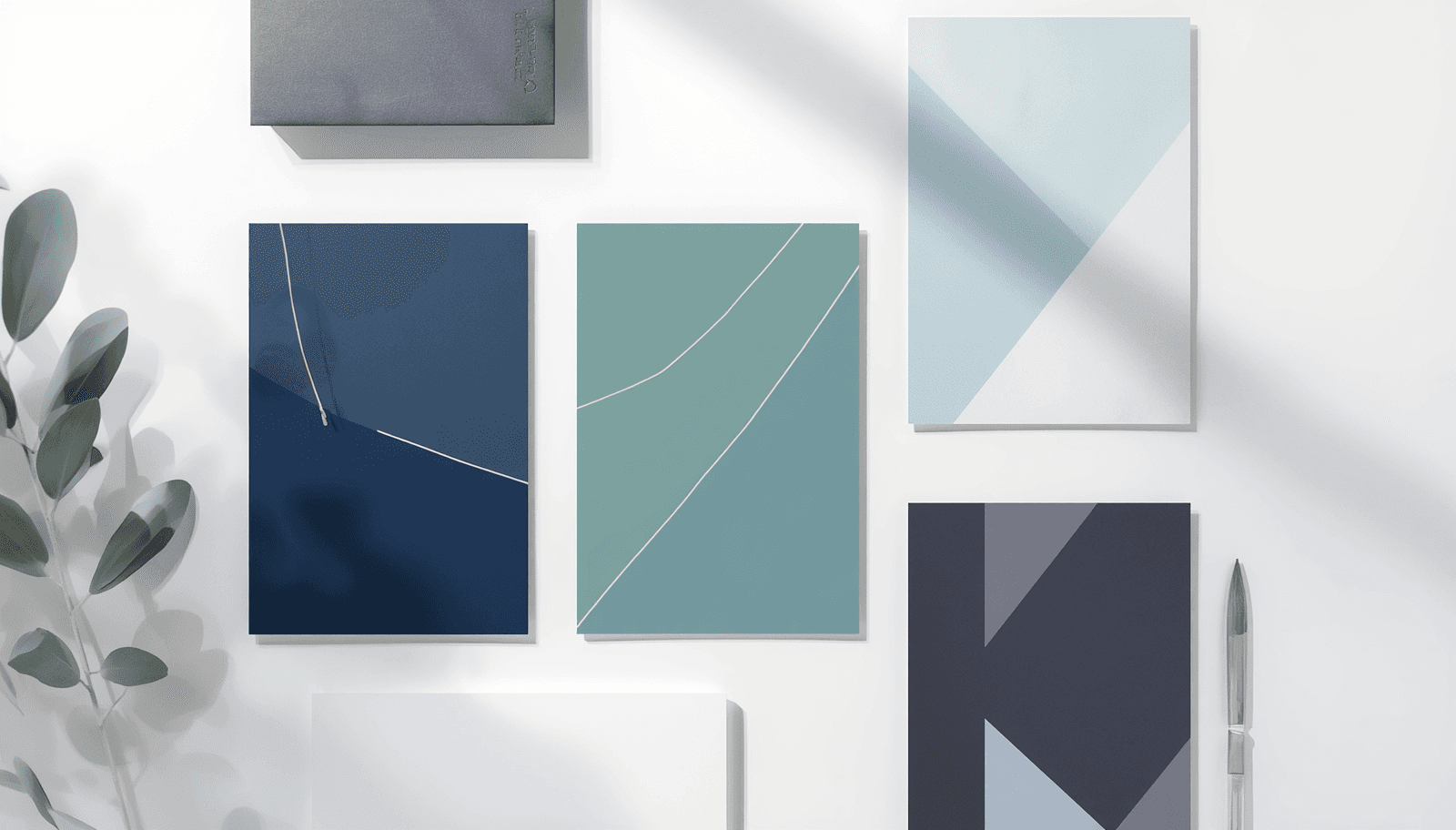
Cool Color Palettes by Hue
1. Trust Blue
Deep Navy: #1B3A5C
Mid Blue: #3B6EA5
Pale Sky: #C8DCEB
Off White: #F5F8FA
The most reliable cool palette for finance, healthcare, and B2B SaaS — not because blue has some fixed universal meaning, but because it's become the established category convention in contexts where stability and lower-arousal credibility matter more than excitement. The trade-off, worth being upfront about: blue is so heavily used in these categories that it increasingly signals "safe default" rather than genuine differentiation, particularly in crowded SaaS and fintech markets.
2. Calm Sage
Sage Green: #7A9476
Deep Forest: #2D4A2E
Pale Mint: #DCE8D8
Warm Cream: #F5F0E4
Green carries blue's calming properties alongside some of yellow's energizing quality, which is part of why it occupies a slightly different psychological register than pure blue — associated with growth, renewal, and natural balance rather than pure institutional stability. This makes sage-led palettes particularly effective for wellness, sustainability, and healthcare brands wanting calm without blue's more corporate, financial-services association.
3. Quiet Lavender
Deep Plum: #4B3460
Lavender: #A894C4
Pale Lilac: #E8DCF0
Soft White: #FAF8FC
Purple carries a genuinely different historical weight than blue or green — for most of human history, purple dye was extraordinarily rare and expensive (Tyrian purple was once worth more than its weight in gold), which is the actual root of its enduring luxury association rather than any inherent psychological property of the wavelength itself. In 2026, purple-led palettes are seeing particular adoption in creative tools and AI products specifically because they read as premium and slightly unconventional without the energetic intensity of warm colors.
Worth noting honestly: research on color preference by gender has found women show measurably stronger preference for purple than men do, while men show a comparatively stronger aversion to it — a real consideration if a brand's audience skews heavily toward one gender, though far from a reason to avoid purple outright for a general audience.
4. Ocean Depth
Deep Teal: #1A4D4D
Ocean Blue: #2E7D8C
Seafoam: #A8D4CC
Sand White: #F2EFE6
Teal sits at the genuine intersection of blue and green, carrying both colors' calming associations simultaneously. This palette performs particularly well for travel, hospitality, and outdoor brands wanting to reference water and natural environments directly rather than evoking calm through abstraction alone.
5. Tech Frost
Frosted Blue: #5B8AA8
Graphite: #3A3F47
Ice White: #EDF2F5
Charcoal: #1A1D21
Current 2026 UI design coverage specifically identifies frosted blue and graphite-adjacent cool tones as part of a move toward "clarity and tech elegance" in product interfaces — a cooler, more restrained register than the saturated electric blue that's dominated SaaS branding for the past several years. This palette works well for products wanting to signal precision and quiet sophistication rather than the more aggressive "fast and disruptive" energy that brighter blues communicate.
How to Choose Between Blue, Green, and Purple
The honest answer is that the choice should follow brand personality and category context more than any fixed psychological formula. A color that genuinely fits a brand's actual personality consistently outperforms a "psychologically optimal" color that feels mismatched to the category — choosing blue purely because "blue means trust," without checking whether blue actually fits the brand's intended personality, is a common and avoidable mistake.
A useful diagnostic: if every direct competitor in your category already uses blue, that's a signal blue may be the conventional choice rather than the differentiated one. Green or purple, applied with the same underlying cool, low-arousal psychological function, can sometimes deliver the calm-and-trustworthy signal a brand needs while standing out more clearly from a blue-saturated competitive field.
Accessibility Note for Cool Palettes
Cool color palettes generally perform well for contrast because most of the combinations above pair a genuinely dark cool shade with a genuinely light cool tint — deep navy on off-white, deep forest on cream — which typically clears the WCAG 2.1 minimum of 4.5:1 for body text comfortably. The risk zone is mid-tone cool colors used directly against each other, such as mid-blue text on pale mint, where the contrast ratio can fall short even though both colors visually read as part of the same cohesive cool palette. Check any pairing intended for text specifically before finalizing, rather than assuming "cool and cohesive" automatically means "accessible."
Related Guides on ThemePalette
For the warmer end of the spectrum to compare against, Vibrant Color Combinations covers high-saturation, high-energy palettes that sit opposite cool tones on the emotional register. The trending color palettes for 2026 guide covers where specific cool hues — particularly digital lavender — fit within this year's broader design direction. If you're building out a complete brand system rather than choosing a single palette, How to Create a Brand Identity with Colors walks through the full strategic process this guide's "choosing between blue, green, and purple" section is part of. And ThemePalette's generator can build and export any of the cool palettes above with contrast ratios shown during creation.
Conclusion
Cool color palettes earn their calming, trustworthy reputation through real psychological mechanisms, but the popular shorthand version of that research — fixed, universal color meanings — oversimplifies what actual researchers in the field describe as a context-dependent effect. Choosing between blue, green, and purple should follow brand personality and competitive differentiation, not just which color a quick infographic says means "trust."
Build and test your own cool color palette at ThemePalette.com.