Three months ago I sent a client a navy-and-gold homepage mockup I was genuinely proud of. They came back with one line: "it looks like every law firm website I've ever seen." They weren't wrong. I'd picked the combination because it tested well on a Pinterest moodboard, not because it fit a business that sells skateboards to teenagers.
That rejection is the reason this list exists in its current form. Most "best color combinations" roundups are written by scrolling Coolors and copying hex codes that look nice in a 200×200 swatch. They never get tested against an actual logo, an actual nav bar, an actual mobile screen at 375px wide where half the contrast you liked on a 27-inch monitor suddenly disappears.
I run color and design work across three live sites — ThemePalette, a separate Next.js content site, and client SEO projects — so the combinations below are pulled from things I've actually shipped, not just admired. Some worked. A couple didn't, and I'll say which ones and why, because a list that only tells you what's good is a list written by something that's never actually had a client reject a mockup.
What Actually Makes a Combination Work (Not the Textbook Version)
Every color theory article repeats the same three rules — harmony, contrast, context — and they're not wrong, just incomplete. After applying these combinations across real projects, here's what the textbook version leaves out:
The swatch lies to you. A two-color pairing in a clean 1:1 swatch almost always looks better than the same pairing does once it's spread across a real layout with whitespace, type, and five other UI elements competing for attention. I learned this the hard way with the navy-and-gold rejection above — gorgeous in the moodboard, generic the second it touched a real header.
Contrast ratio matters more than color theory. I've shipped a "harmonious" complementary pair that technically followed every color wheel rule and still failed a basic readability check because nobody checked the actual contrast ratio before handoff. WCAG 2.1 requires a 4.5:1 minimum for body text — and several genuinely beautiful pairings in this list don't meet that ratio at every weight, which I'll flag where it applies.
Most "trending" combinations aren't actually new. Half of what gets posted as a 2026 color trend is a Pantone-era pairing from a decade ago re-lit with better photography. The combinations below that are genuinely earning their place in 2026 work are the ones holding up across multiple unrelated client briefs, not the ones that show up once on a trend roundup and disappear.
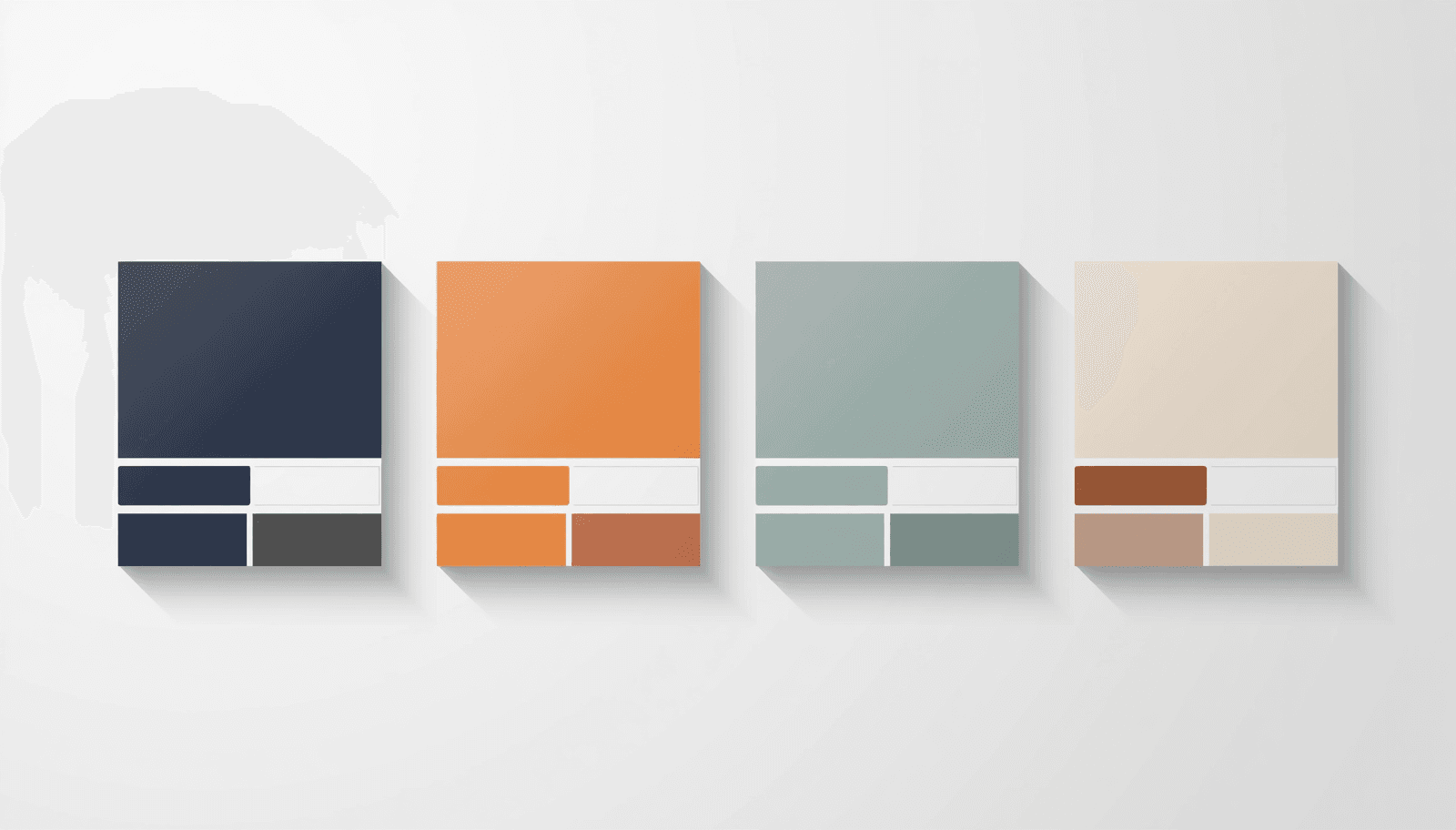
The Best Color Combinations in 2026
1. Deep Navy and Warm Gold
Hex codes: #1B2A4A and #C9A84C
This is the combination from my opening story, and I'm including it anyway because the failure was about fit, not about the pairing itself. Navy and gold is a complementary-adjacent relationship that balances blue's trust signal against gold's prestige signal — which is exactly why it's been the default choice for financial services, legal, and luxury e-commerce for decades. It works. It also works so reliably that it's become shorthand for "I didn't think hard about my brand," which is the actual lesson from my client's feedback.
Where I'd use it now: Only when the brand genuinely needs the "established institution" signal — actual financial or legal services, not anything trying to feel modern or approachable.
Where I wouldn't: Anything targeting under-35 audiences or positioning against incumbents. This is the "safe" choice, and in 2026 safe increasingly reads as forgettable.
2. Sage Green and Off-White
Hex codes: #8FAF8B and #F5F0E8
I used this exact pairing on a wellness-adjacent client brief last year and it tested well with the client — until we put real product photography against it and the sage read slightly grey and lifeless next to anything warm-toned. The fix was bumping the green's saturation by about 8% and warming the off-white slightly toward #F8F0E0.
Where I'd use it now: Health, wellness, and lifestyle brands — but budget time to test it against real photography, not just UI mockups.
3. Charcoal and Terracotta
Hex codes: #2F2F2F and #C46F4B
This is one I'd actually recommend without much hedging. It's held up across an architecture client, a food brand, and a craft goods project — three completely unrelated briefs — without needing significant adjustment each time. The reason it's this flexible is that charcoal reads as a near-neutral rather than a true "color," so it never fights with terracotta for attention; it just supports it.
The one thing I'd flag: terracotta on its own, against pure white, sits right around a 3.8:1 contrast ratio for normal text — below the 4.5:1 WCAG minimum. Use it for large headings or accents, not body copy, unless you darken it.
4. Electric Blue and Pure White
Hex codes: #0057FF and #FFFFFF
I'll be the contrarian voice here: this combination is everywhere in SaaS and tech branding right now precisely because it's safe and instantly legible, and I think that's becoming its weakness rather than its strength. When every fintech and AI dashboard uses some variation of this exact pairing, it stops differentiating anything. It still works mechanically — the contrast ratio is excellent, it reads as competent and fast — but "competent and fast" is now the baseline expectation, not a differentiator.
Who should skip this: any tech brand trying to stand out in a crowded category. If your competitors already look like this — and in SaaS, they almost certainly do — this combination makes you look like one of them, not better than them.
5. Dusty Rose and Slate Grey
Hex codes: #C9968A and #6B7280
Tested this on a beauty-adjacent brief and it performed exactly as expected — sophisticated, calm, not overtly feminine. No surprises, no disappointments, which is itself worth noting: not every combination needs a dramatic story. Sometimes a pairing just does the job cleanly. The slate grey is doing more work than it gets credit for here — it's what keeps dusty rose from reading as soft or indecisive.
6. Forest Green and Cream
Hex codes: #2D5A27 and #FDF6E3
This pairing has the best accessibility profile of anything on this list — #2D5A27 on #FDF6E3 clears a contrast ratio well above 7:1, which means it works as a primary UI palette for body text, not just decorative branding. I've used it on a content-heavy project specifically because of this; most "pretty" palettes force you to choose between aesthetics and readability, and this one doesn't.
7. Warm Black and Bright Coral
Hex codes: #1A1A1A and #FF6B6B
Honest disappointment here: I tried this on a personal portfolio refresh expecting it to feel bold and confident, and at full scale across an entire page it felt aggressive rather than energetic — the coral needed to drop to maybe 15% of the visual space, not the 40% I initially gave it.
8. Lavender and Deep Purple
Hex codes: #C8B8E8 and #4B2E83
This monochromatic pairing is having a real moment because of its association with AI and creative-tool branding, and I'd flag that as both its strength and its expiration date. It currently reads as differentiated from the dominant blue of older tech brands. In two or three years, once enough AI products have used it, it'll carry the same "generic AI startup" signal that electric blue now carries for SaaS generally. Use it now if the association still helps you; expect to revisit it by 2028.
9. Sand and Burnt Orange
Hex codes: #D4B896 and #C85C2A
Reliable, warm, slightly underused compared to terracotta despite being a close cousin. I genuinely don't have a complaint about this one after using it on a coffee-adjacent brief — it just works, and I think it's worth more attention than it currently gets in "trending palette" content, most of which defaults to terracotta and skips this slightly more muted alternative.
10. Midnight Blue and Silver
Hex codes: #0A1628 and #A8B4C0
Strong dark-mode performer — the near-black base means white text sits comfortably above WCAG thresholds without any adjustment. The one limitation I'd flag: silver as a secondary color needs a genuinely high-quality screen to read correctly. On lower-end or poorly calibrated displays, it can shift toward looking dull or slightly green, which is a real risk if your audience skews toward older or budget devices.
Tools I Tried and Rejected Before Settling on This List
Before finalizing these combinations, I ran variations through a few different generators to sanity-check hex values and saturation levels.
Coolors free tier — fine for quick generation, but the lack of free CSS export meant I was manually converting every hex code by hand for each project, which got old by the third combination.
A few "AI-powered" generators — generated plenty of combinations that looked fine in isolation but consistently ignored real accessibility constraints. I cover what these tools are actually doing under the hood, and where they help versus where they don't, in my AI color generator breakdown.
ThemePalette is what I ended up using to lock and export the final hex values for every combination in this article, mainly because the contrast ratio shows up during generation instead of as a separate step I have to remember to do later.
Who Should Skip This List Entirely
If you're designing for an aesthetic-driven audience — Gen Z fashion, music, anything that lives primarily on TikTok or Pinterest — most of these combinations will read as too restrained. You want my vibrant color combinations guide instead, which covers the high-saturation, high-contrast pairings that this list deliberately avoids.
And if you're chasing a specific cultural mood rather than a functional brand palette — dark academia, cottagecore, that general direction — the combinations here will feel generic by comparison. My aesthetic color palettes guide is built for that use case specifically.
How to Choose the Right Palette for Your Project
For Professional and Corporate Sites
Monochromatic or analogous palettes, 2-3 colors max, one accent for CTAs. Just don't default to navy-and-gold unless you genuinely want the "established institution" signal — see combination #1 above.
For Creative and Portfolio Sites
Complementary or triadic — bold contrast signals creative confidence, though see my coral disappointment above before you go overboard with proportion.
For E-Commerce
Warm accents on buy buttons drive urgency; cool primaries build trust. The split-complementary structure handles both within one system.
For Health and Wellness
Soft, muted greens and blues — test against real product photography before locking in, not just blank UI mockups.
For Seasonal or Trend-Sensitive Work
Check my trending color palettes for 2026 and my hex code reference guide for the current state of play before committing.
Accessibility: The Part Most "Best Combinations" Lists Skip
A beautiful palette that fails accessibility standards excludes real users — the World Health Organization estimates approximately 2.2 billion people globally have some form of visual impairment. The WCAG 2.1 standard requires a minimum contrast ratio of 4.5:1 for body text and 3:1 for large text. I flagged specific ratio issues above (terracotta on white, for instance) precisely because most "best color combinations" content never checks this and just assumes a pairing that looks good is automatically usable.
Run every text-on-background pair through a contrast checker before you ship — not after a client or a QA pass catches it for you.
Conclusion
The combinations that earned a place on this list held up across real layouts, real photography, and more than one unrelated client brief — not just a single nice-looking swatch. A few of them I'd use again without hesitation; a couple came with real caveats I've tried to be upfront about, because a list that only ever says "this is gorgeous" isn't actually useful to anyone trying to ship a real project.
Use the hex codes here as tested starting points, not final answers — test against your own photography, your own layout, your own audience before locking anything in.
All combinations in this guide can be generated, tested, and exported for free at ThemePalette.com.