
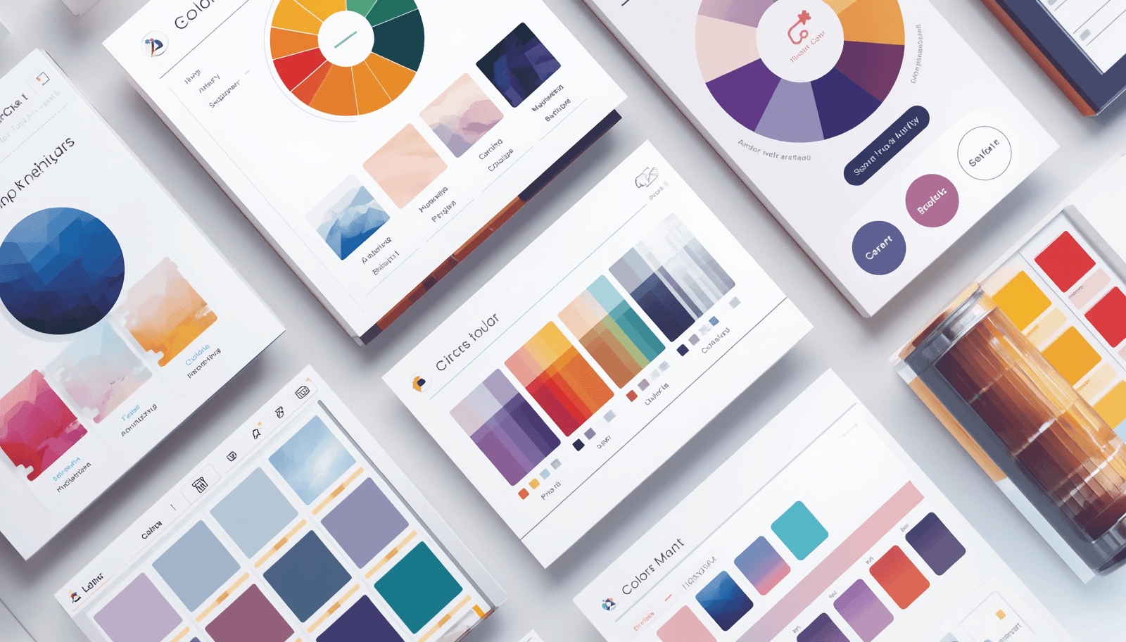
You open a new design file, stare at the blank canvas, and the first real decision you have to make isn't layout — it's color. That moment of "what goes with what" is exactly why a free color palette generator has quietly become one of the most-opened tabs in any designer's browser.
There's no shortage of options in 2026. Adobe Color, Coolors, Paletton, and a handful of newer AI-assisted tools all promise the same thing: fast, harmonious palettes without touching a paid plan. The differences only show up once you've actually used a few of them on real projects, which is what this comparison is built around.
What Is a Free Color Palette Generator?
A free color palette generator is a no-cost design tool that builds coordinated sets of colors, usually by extracting hues from an uploaded image, applying color theory rules, or letting you spin a manual color wheel. Most export the result as HEX, RGB, or HSL codes, ready to drop straight into design software.
That sounds simple, but the tools behave quite differently in practice. Some are built for speed and inspiration; others are built for precision and accessibility. Knowing which camp a tool falls into saves you from picking the wrong one for the job.
Why a Free Palette Tool Actually Matters
It's tempting to treat color choice as a small detail. It isn't. Adobe's own 2025 consumer survey of 1,000 U.S. shoppers found that half of consumers have picked one brand over a competitor based on color alone, and that number climbs to 51% among Gen Z and millennial respondents. Color isn't decoration — it's a buying signal.
The same survey found blue is the color people trust most, with 54% naming it their most trusted brand color, followed by black at 44%. Sixteen percent of consumers said color is the very first thing they notice about a brand, right behind the logo itself. None of that happens by accident — it happens because someone made a deliberate palette decision early in the process.
A good free palette tool gets you to that deliberate decision faster:
It shortens the early, exploratory phase of design from hours to minutes.
It reduces mismatched colors that quietly undermine brand consistency.
It gives non-designers — founders, marketers, small teams — a credible starting point without hiring a colorist.
A growing number of tools now flag contrast ratios automatically, which helps with accessibility compliance long before launch.
How These Tools Actually Work
Strip away the branding and most free color palette generators follow the same basic mechanics:
You give it an input — an image, a single base color, or a blank slate.
It applies color theory — complementary, analogous, monochromatic, or triadic rules generate a coordinated set.
You refine manually — lock the colors you like, regenerate the rest, repeat until it feels right.
You export — HEX, RGB, or HSL codes, often with one-click copy into Photoshop, Illustrator, or Figma.
Adobe Color, for instance, has built its "Explore" library around exactly this loop — thousands of community and Behance-sourced palettes that drop straight into a Creative Cloud library with one click. It's a genuinely smooth workflow for early-stage inspiration.
Best Free Color Palette Generator Tools Compared
Tool Type | Strengths | Trade-Offs |
Adobe Color | Deep Creative Cloud integration, huge community library, strong for harmony rules | Weaker for strict WCAG accessibility validation or complex design systems |
Coolors | Fast keyboard-driven generation, browser extension, simple exports | Best features (advanced PDF export, palette visualizer) sit behind a paid tier |
Paletton | Strong for fine-tuned color harmony and contrast testing | Interface feels dated compared to newer tools |
Dedicated contrast checkers (Stark, Contrast) | Purpose-built for accessibility and WCAG compliance | Not a full palette generator on their own — best paired with another tool |
Image-based extractors | Pulls real, photographed color harmony almost instantly | Limited control over exact final shades |
No single tool wins every category. Designers who've used more than one of these tend to land on a combination — Adobe Color or Coolors for fast generation, paired with a dedicated contrast checker before anything ships.
Where Free Generators Fit Into the Bigger Color Picture
A generated palette is rarely the finish line. It connects to a wider set of color decisions that shape how a brand or product actually looks once it's live.
Color contrast checkers confirm that text and background combinations meet accessibility standards.
Color wheel theory is the underlying logic almost every generator runs on.
Hex-to-RGB conversion matters the moment a palette has to move between web and print.
Brand color systems turn a single generated palette into something consistent across every touchpoint.
If the end goal is a cohesive brand rather than a one-off palette, it's worth reading through brand identity colors — a generated palette is only the opening move, not the full brand color system.
And if your project leans bold rather than balanced, comparing outputs against a neon color palette shows how differently these generators behave once you push them toward extreme saturation instead of harmony.
Practical Tips From Actually Using These Tools
A few habits separate a palette that gets used from one that gets abandoned after five minutes:
Anchor on one fixed color first — your brand color or the dominant tone in a reference photo — then let the generator build around it, rather than starting from total randomness.
Don't trust exported codes blindly. HEX values can shift slightly between tools, so verify them once before they go into a live brand system.
Run contrast checks before you finalize anything. A palette that looks great on a designer's monitor can fail readability tests on a phone screen in daylight.
Save your favorites outside the tool. Most free accounts cap how many palettes you can store, and losing a perfect combination is a frustrating way to learn that.
View the palette across devices. What reads as balanced on one screen can shift noticeably on another due to calibration differences.
For anyone who wants more certainty than a randomized generator can offer, working from a set of color palettes with hex codes gives a more reliable starting point than clicking "generate" repeatedly and hoping.
Common Mistakes to Avoid
Even with a solid tool, a few habits quietly sabotage good palettes:
Hitting "generate" over and over without any anchor point, which rarely produces something cohesive.
Ignoring contrast and accessibility until after a design is already built.
Skipping a manual check on exported color codes, since small shifts between tools do happen.
Cramming six, eight, or ten colors into one palette instead of the four to six that most professional systems actually use.
Picking a tool because the interface looks nice, rather than because the export quality holds up.
Browsing a set of pretty color palettes before generating your own is a useful way to calibrate expectations, so the first random output a tool spits out doesn't automatically become the final answer.
Where Theme Palette Fits In
Theme Palette has spent years curating and stress-testing color combinations across branding, interior, and digital design work — the kind of hands-on experience that shapes what actually makes it onto the site. Instead of leaning purely on algorithmic randomness, Theme Palette pairs tested color theory with real project context.
That distinction matters because free generators are genuinely good at speed, but they rarely account for context — how a color reads in print, on a dim screen, or scaled across an entire brand system. Theme Palette closes that gap with pre-built, expert-reviewed palette collections that skip the guesswork stage entirely.
For anyone who wants generator-speed results with a more dependable foundation underneath them, Theme Palette offers ready-to-use palettes built around combinations that have actually been tested, not just generated once and forgotten.
Conclusion
Free color palette generators have made solid color matching available to anyone, design background or not, and the data backs up why that matters — half of consumers admit color alone has swayed which brand they chose. The right tool still depends on what you need: Adobe Color and Coolors for speed and inspiration, dedicated checkers for accessibility, and a manual eye for everything in between. No single tool covers all three.
If you'd rather skip the trial-and-error stage altogether, explore the expert-curated palette collections on Theme Palette and start from combinations that are already tested.