I tried shipping a neon palette across an entire landing page once — every section, full saturation, no restraint — and the client's first feedback call lasted four minutes before they asked us to "make it less like a rave." That failure taught me more about how neon actually works in production than any color theory reading did: neon isn't a palette you apply everywhere, it's a tool you apply somewhere specific, and the entire effect depends on what surrounds it.
This guide covers neon color palettes that genuinely work in 2026 design — with hex codes, the specific contexts where neon performs well, and the production limitations (accessibility, print, dark mode dependency) that most "bright color inspiration" roundups skip entirely.
What Makes a Color "Neon," Technically
Neon colors are not simply bright versions of standard hues. They are fluorescent — colors formulated to absorb invisible UV light and re-emit it as visible light, which is why they appear to glow rather than just look saturated. This effect was first commercialized by Bob Switzer in the 1930s, who developed fluorescent pigments after a period of recovery in a darkened room following an accident, eventually building the technology that became Day-Glo fluorescent paint and ink.
In digital design, true fluorescence can't be replicated — a screen pixel simply displays maximum-intensity RGB values, it doesn't fluoresce. What digital "neon" actually does is simulate the visual effect through extremely high saturation combined with a dark surrounding context, since the perceived glow of neon depends heavily on contrast against its background, not on the color itself.
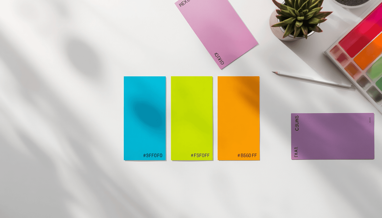
Neon Color Palette for 2026
1. Cyber Pink and Deep Cobalt (Synthwave Classic)
Cyber Pink: #FF1493
Deep Cobalt: #1E3A8A
Near Black: #0A0A14
This pairing is one of the most consistently referenced neon combinations in current design coverage, sitting at the center of the ongoing synthwave and vaporwave revival. The near-black background isn't optional — it's what allows both colors to read as "glowing" rather than simply bright. Drop this same pink and cobalt onto white and the entire effect collapses into something closer to a children's product than a retro-futuristic one.
Where it works: Gaming interfaces, music and entertainment branding, nightlife and event promotion.
2. Electric Lime and Slate Grey (Industrial Tech)
Electric Lime: #CCFF00
Slate Grey: #3A3F47
Charcoal: #1A1D21
The pairing of acidic lime with a cool industrial grey produces a more restrained neon effect than pure synthwave palettes — the lime functions as a single accent against a tech-utilitarian base rather than competing with another equally loud color. This is closer to the "hyper-saturated accent" approach increasingly used in 2026 UI design, where one bold color highlights navigation and active states against an otherwise dark, restrained interface, rather than neon dominating the full composition.
Where it works: Developer tools, fitness tech, industrial and engineering brand identity.
3. Ultraviolet and Molten Orange (Sunset Noir)
Ultraviolet: #8B00FF
Molten Orange: #FF4500
Deep Plum: #1A0E2E
This near-complementary pairing produces strong visual vibration when both colors sit at equal intensity — a genuinely useful effect for poster art and motion graphics, genuinely uncomfortable if applied to anything meant to be read for more than a few seconds. Used deliberately, with one color dominant and the other reserved for small accent moments, it avoids the discomfort while keeping the intensity.
Where it works: Festival and event branding, music streaming apps, motion graphics.
4. Electric Blue and Magenta (Streaming Dark Mode)
Electric Blue: #0080FF
Magenta: #FF00AA
Rich Black: #0D0D0D
Streaming and entertainment platforms have specifically adopted this combination against rich black backgrounds to create a cinematic, immersive feel that highlights navigation and active states without overwhelming the actual content being displayed. The key production detail: rich black here means a near-black with very slight warmth or coolness rather than pure #000000, which renders with less harsh banding on OLED displays.
Where it works: Streaming platforms, entertainment apps, dark-mode-first products.
5. Neon Green and Hot Magenta (Vaporwave Trinity, Extended)
Neon Green: #39FF14
Hot Magenta: #FF00FF
Cyan: #00FFFF
The "holy trinity" of vaporwave aesthetics is technically cyan, magenta, and pastel pink, but a fully neon variant swaps the pastel pink for hot magenta and adds neon green as a fourth accent for genuinely maximalist applications. This is the least restrained palette in this guide — appropriate specifically for aesthetic-driven, nostalgia-first projects rather than anything needing broad, comfortable readability.
Where it works: Vaporwave and retro-digital aesthetic projects, Gen Z fashion and music branding, art and illustration.
Where Neon Actually Works (And Where It Doesn't)
It works as a single accent against dark backgrounds. The mechanism that makes neon read as "glowing" rather than just bright depends on the dark surrounding context. A neon color dropped onto a white background mostly just looks bright, not luminous — the entire visual effect that makes neon distinctive disappears.
It works for short, high-emphasis content. Posters, event promotion, single CTA buttons, navigation highlights. It does not work well for body text or any content meant to be read for an extended period, partly because of the vibration effect between high-saturation adjacent colors and partly because of accessibility limitations covered below.
It does not reproduce accurately in standard print. Standard CMYK printing cannot replicate the visual intensity of a digital neon color or true fluorescent ink. Reproducing an authentic neon look in print requires fluorescent spot colors — Pantone's 800-series inks are the standard reference — or UV-reactive coatings, neither of which is available through a standard four-color print process. If a neon-branded project also needs business cards or packaging, this needs to be flagged to a print vendor early, not discovered after the first proof comes back disappointingly dull.
Accessibility: The Part Most Neon Inspiration Content Skips
Neon colors frequently fail WCAG contrast and comfort standards because of their extreme brightness and the vibration effect that occurs when high-saturation colors of similar lightness sit adjacent to each other — both of which can cause real eye strain, and both of which matter specifically for users with photosensitivity or certain color vision deficiencies.
In practice, this means: never use a neon color as body text color, always provide a less intense alternative for any text-heavy version of a neon-branded interface, and test every neon-on-dark text pairing against the WCAG 2.1 minimum contrast ratio of 4.5:1 before shipping — a color can look perfectly legible on a calibrated design monitor and still fail this check, since neon hues frequently sit in a luminance range that produces lower actual contrast than their visual intensity suggests.
ThemePalette's generator displays contrast ratios during palette creation, which is the fastest way to catch a neon pairing that looks dramatic but fails basic legibility before it reaches production.
A Calmer Alternative, If Neon Is Too Much
Not every brief that wants "bold" or "eye-catching" actually needs full neon intensity. Pretty Color Palettes covers the softer end of the spectrum — useful to review side by side with this guide if a client's "make it pop" request turns out to mean something gentler once you see both options presented together.
Conclusion
A neon color palette earns its impact through restraint, not abundance — one glowing accent against a dark, deliberate background does more work than five fluorescent colors competing for the same attention. The combinations in this guide come with the production caveats — accessibility, print reproduction, dark-mode dependency — that determine whether a neon palette actually ships cleanly or becomes a four-minute client call asking you to tone it down.
Build and test your own neon palette at ThemePalette.com.