
Some palettes just feel right. You see them in nature, in well-designed interiors, in brand identities that feel effortless. More often than not, those palettes are built on analogous colors — a foundational concept in color theory that designers rely on for creating calm, cohesive, and professional visuals.
If you have ever felt that a design looks polished but could not explain why, analogous color harmony is likely the reason.
What Are Analogous Colors?
Analogous colors are groups of three or more colors that sit adjacent to one another on the color wheel. Because they share a common hue base, they naturally complement each other without clashing. The result is a palette that feels unified, smooth, and visually consistent.
A classic example: yellow, yellow-green, and green. Or red, red-orange, and orange. These combinations appear constantly in nature — a sunrise blending amber into pink, forest foliage shifting from lime to deep green — which is part of why the human eye reads them as pleasing rather than jarring.
Designers and artists have used analogous color schemes for centuries, long before the terminology was formalized. Today, they remain one of the most reliable tools in any visual communicator's kit.
Why Analogous Color Schemes Work So Well
The power of an analogous scheme comes from its built-in restraint. Unlike complementary colors — which create high contrast by pairing opposites — analogous colors work with similarity rather than tension. That makes them ideal for designs where harmony matters more than drama.
There are three specific reasons they perform so consistently:
Visual coherence: Adjacent hues share color DNA, so the eye moves across a palette without jarring shifts.
Emotional consistency: Because the colors are tonally related, they reinforce a single mood rather than creating competing emotional signals.
Versatility: An analogous palette can skew warm or cool, saturated or muted, depending on the section of the color wheel you draw from.
According to color theory research cited by the Interaction Design Foundation, analogous color schemes are among the most used in successful branding and UI design precisely because they reduce visual noise while maintaining distinctiveness.
Building an Analogous Color Palette Step by Step
Creating an analogous palette is more intentional than it appears. Here is a practical process:
Choose an anchor hue. Pick the color that best represents the dominant mood of your project — this will be your dominant color.
Select two to three adjacent colors. Move one to three steps clockwise or counterclockwise on the color wheel. Stay within a 60–90 degree arc for a true analogous scheme.
Vary saturation and lightness. Flat schemes with identical saturation look amateurish. Pull one color into a lighter tint and push another toward a deeper shade to add depth.
Add a neutral base. White, off-white, charcoal, or black gives the palette breathing room and makes the colors pop.
Test in context. Apply your palette to actual design mockups — headers, backgrounds, buttons, body text — before committing.
For reference, ThemePalette's collection of color palettes with hex codes shows how professional palettes are structured with exact values, which is useful when building your own analogous sets from scratch.
Analogous vs. Similar Color Schemes
Designers sometimes use "analogous" and "similar colors" interchangeably, but there is a meaningful distinction worth understanding.
An analogous scheme is defined by position on the color wheel — adjacent hues within a specific degree range. A "similar" color scheme is a broader term that can include tonal variations of a single hue (monochromatic) or loosely related colors that simply share a temperature (warm or cool) without strict adjacency.
Understanding this difference helps when you are choosing a harmony rule in tools like Adobe Color or Paletton. Selecting "analogous" in those tools applies the strict adjacent-hue definition, giving you a more controlled output than a general "similar colors" search would.
Where Analogous Colors Work Best
Brand identity and logo design: Brands that want to feel approachable, natural, or sophisticated often reach for analogous palettes. Think of earthy green-to-teal combinations used in wellness brands, or blue-to-violet palettes seen in technology companies aiming for calm authority.
Choosing the right palette for a brand requires understanding what each color communicates emotionally and culturally. ThemePalette's guide on brand identity colors covers this in depth — it is a useful companion when selecting your analogous set for a client or personal brand.
UI and web design: Analogous schemes work exceptionally well for interface design because they allow color-coded hierarchy — using lighter and darker steps of adjacent hues — without introducing the visual tension that complementary schemes can create in dense layouts.
Interior design and physical spaces: Analogous color flow across walls, furniture, and textiles creates rooms that feel cohesive and curated. Many interior designers explicitly use the 60-30-10 rule (dominant, secondary, accent) alongside an analogous palette to achieve balance.
Illustration and digital art: Analogous color harmony gives illustrations a painterly, naturalistic quality. It is the reason landscape paintings and nature photography consistently feel visually satisfying — they are pulling from narrow sections of the color spectrum already present in the subject.
Analogous Color Harmony and Adjacent Colors — The Nuance
One of the more interesting aspects of analogous schemes is how the placement of your accent color shifts the mood entirely.
If you center your palette in warm hues — red-orange, orange, yellow-orange — the result feels energetic and inviting. Shift that same range to cool hues — blue-violet, blue, blue-green — and the palette reads as calm and sophisticated. The structural logic is identical; the emotional output is completely different.
This is why understanding color harmony goes hand in hand with understanding color psychology. The "adjacent colors" principle gives you structure; what you do with that structure determines whether your design feels like a spa or a sports brand.
For projects requiring both harmony and visual interest, some designers introduce a subtle accent from a slightly more distant hue — not a full complement, but a color that provides a small amount of contrast without breaking the overall cohesion. This modified analogous scheme is widely used in editorial design and packaging.
Pretty Analogous Palettes Worth Exploring
Not all analogous palettes are equal. The most effective ones are those where the hue selection, saturation level, and tonal variation have been considered together rather than generated at random.
Some of the strongest analogous combinations currently trending in design:
Sage to forest green — popular in wellness, lifestyle, and sustainable brand design
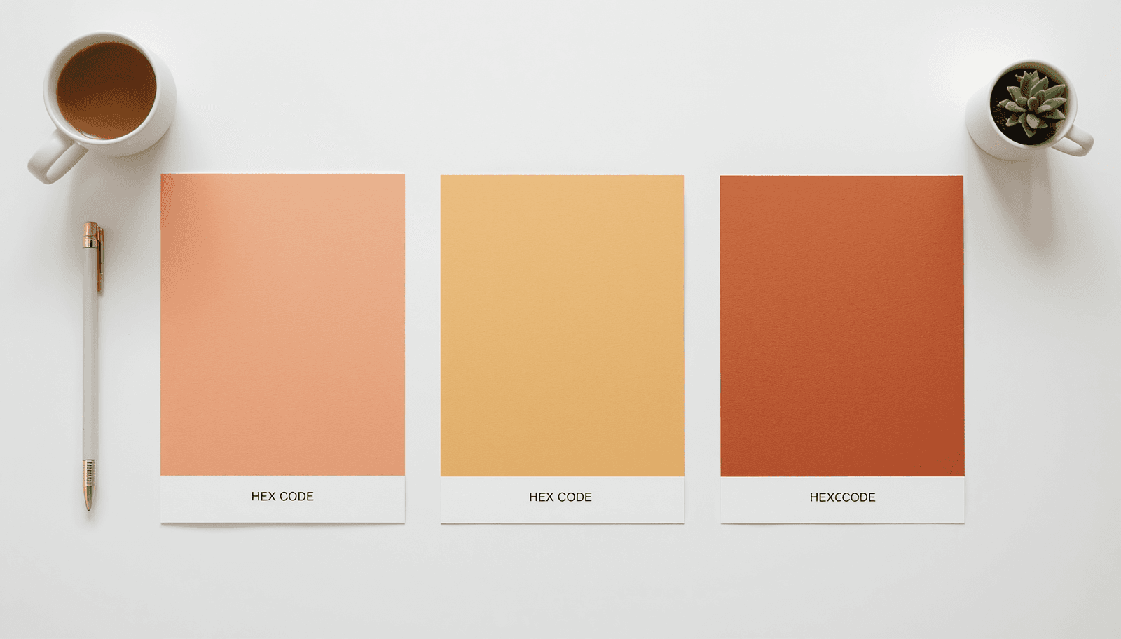
Peach to terracotta — warm, grounded, widely used in food, beauty, and interior brands
Sky blue to teal — clean and modern, favored in fintech and SaaS product design
Lavender to deep violet — premium feel, common in luxury and creative agency branding
ThemePalette's curated pretty color palettes includes several analogous combinations like these, organized for direct use in design projects without the need to build from scratch.
Common Mistakes When Using Analogous Color Schemes
Even with the built-in harmony of adjacent hues, designers make predictable errors.
Using identical saturation across all colors. When every color in an analogous palette sits at the same saturation and brightness level, the palette becomes flat. Variation in tone is what gives the scheme visual depth.
Selecting too wide an arc. Stretching your palette beyond 90 degrees on the color wheel starts to move away from true analogous harmony. The closer together your hues sit, the more cohesive the result.
Forgetting contrast for readability. Analogous palettes are harmonious — which also means low contrast. For body text, buttons, and interactive UI elements, always verify that your color pairs meet WCAG accessibility standards. A harmonious palette that fails contrast checks is a usability problem, not just an aesthetic one.
Applying it to every element equally. An analogous scheme works through hierarchy — one color dominant, one secondary, one as accent. Distributing all three colors evenly across a design eliminates the hierarchy and makes everything compete for attention.
Ignoring the neutral layer. Without a white, black, or gray grounding the palette, analogous colors can feel heavy or undifferentiated. The neutral gives the eye a place to rest.
Practical Tips for Working with Analogous Color Harmony
Always build palettes using a reference tool that shows exact hex values, not just visual approximations
Export your final palette as a swatch file or save hex codes before starting production — color drift between screens is real
Test your palette against dark backgrounds as well as light ones, especially if your project has a dark mode variant
For print projects, check that your analogous RGB colors translate correctly to CMYK before going to production — adjacent hues can shift unexpectedly in print
If working with clients, present the analogous palette in context — applied to a mock header, a button set, and a body text block — rather than as isolated swatches
Conclusion
Analogous color schemes are one of the most dependable foundations in design. They work because they align with how the eye naturally processes color — through similarity, flow, and tonal relationship rather than jarring contrast. Whether you are building a brand identity, a product UI, or a visual content series, a well-constructed analogous palette reduces friction and elevates the overall design.
The key is in the details: hue selection, saturation variation, tonal hierarchy, and a neutral anchor. Get those right, and an analogous palette will carry your design further than more complex schemes often do.
Start building yours at ThemePalette — curated analogous palettes with hex codes, ready to use in any project.