I scrolled through a client's Instagram grid last year and couldn't tell which of three competing posts from the same week belonged to their brand at first glance — the color treatment shifted post to post depending on whoever was editing that day. That's the actual problem this guide solves. Not "what colors are trending," but how to build a social media color palette specific enough to survive contact with three different editors, two platforms with different aspect ratios, and an algorithm that increasingly rewards exactly the kind of repetition most creative teams instinctively resist.
The stakes here are larger than they look. Industry research on brand color consistency consistently puts the recognition lift from a consistently applied palette in the range of 80 percent compared to inconsistent color use across touchpoints — a figure that shows up repeatedly across independent marketing research because the underlying mechanism (color as a retrieval cue stored separately from verbal memory) is well established, even if the exact percentage varies by study and methodology.
This guide covers how to build that palette, why platform-specific rendering differences mean a palette can look correct in your design tool and wrong in a feed, and how 2026's specific algorithm shifts on Instagram and TikTok change what "consistent" actually needs to mean in practice.
Why Color Consistency Matters More in 2026 Than It Did Two Years Ago
The mechanics of social platform algorithms have shifted in a way that directly raises the stakes for color consistency, beyond the general brand-memory argument.
Instagram's 2026 ranking system evaluates an account's entire content history rather than judging individual posts in isolation, and accounts that consistently post around a recognizable visual and topical identity receive a measurable boost in Explore distribution.
TikTok's recommendation system works differently — it has historically prioritized an "interest graph" over follower relationships, ranking content based on predicted individual interest regardless of follower count. But the platform's own engagement data shows it converts attention faster than competing platforms specifically because of high-contrast, color-saturated content patterns that read clearly within the first second of a vertical scroll — meaning color choices on TikTok need to register at a glance, in a way that's somewhat more forgiving on a slower-scrolling platform like Instagram's main feed.
The practical implication: a social media color palette isn't just a branding nicety in 2026, it interacts directly with how distribution systems classify and re-distribute your content.
Building a Palette That Survives Real Platform Conditions
Start with Your Core Three, Not Your Full Brand Palette
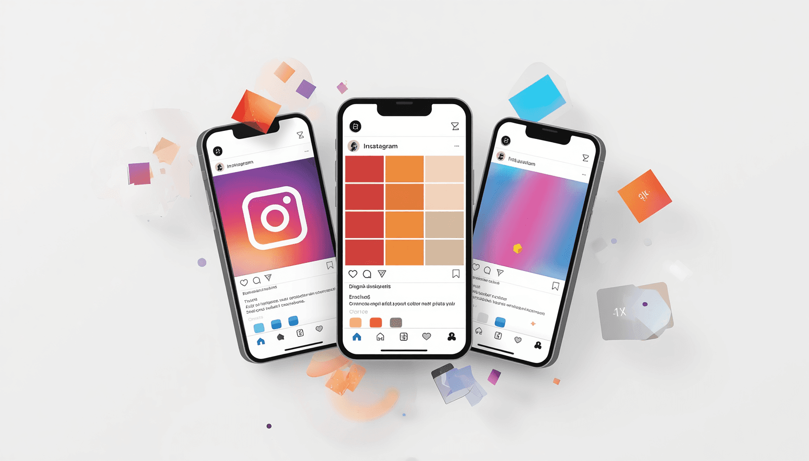
A full brand palette — the five or six colors that might appear across a website, packaging, and print — is usually too many for social use. Reduce to a core set of two to three colors that will appear in nearly every post: a dominant background or accent color, a secondary supporting color, and a single highlight color reserved for calls to action or emphasis. This isn't a limitation; it's what makes a feed instantly recognizable at thumbnail size, which is the actual condition under which most people first encounter a post.
Apply the 60-30-10 Rule to Individual Posts, Not Just the Feed Overall
The 60-30-10 ratio — 60% dominant color, 30% secondary, 10% accent — is a reliable structural rule for individual graphics, not just for the palette as a system. A post that breaks this ratio dramatically (using the accent color as 40% of the frame, for instance) tends to read as visually unbalanced even when all three colors are technically "on brand."
Reserve Off-Palette Color for Specific, Intentional Moments
A rigid, unchanging palette across every single post can read as visually stale over time. The more sustainable approach is to keep a strict core palette but allow specific, intentional departures — a seasonal or campaign accent color for a limited run, or an off-palette highlight color used specifically to draw attention to a time-sensitive post or CTA. The core palette stays intact; the exception is deliberate and limited rather than accidental drift.
Check Contrast for Both Light and Dark Mode Viewing
A meaningful share of mobile users browse with system-wide dark mode enabled, which affects how Instagram and TikTok render surrounding UI — though not the post image itself directly. The more relevant issue is testing your palette against both a white-background feed view and a dark scroll environment (TikTok's default black background, for instance), since a palette calibrated only against a white canvas can look different — sometimes harsher, sometimes washed out — against TikTok's near-black default frame.
Platform-by-Platform Color Considerations
Instagram: Feed Cohesion Plus Format Diversity
Instagram in 2026 rewards format diversity within a consistent topical and visual identity — Reels, carousels, and Stories all under one recognizable color and content theme, rather than a single repeated format. This means your palette needs to hold up across square feed posts, vertical Reels covers, and Stories graphics simultaneously. A palette that only looks good in a square crop can break down in a 9:16 Reels thumbnail if the composition wasn't designed with that aspect ratio's framing in mind.
Instagram's Explore and Feed ranking also now weighs Story engagement against Feed visibility — meaning Stories graphics deserve the same palette discipline as main feed posts, not a lower-effort treatment, since strong Story interaction can boost how your Feed posts rank for engaged users.
TikTok: Legibility at Speed
TikTok's interest-graph model surfaces content based on predicted engagement regardless of follower count, and the platform's content is scanned for visual and audio signals as part of its categorization process. In practical color terms, this means TikTok cover frames and on-screen text need to register clearly within roughly the first second of a vertical scroll — which favors higher contrast between your palette's background and any overlaid text or graphic elements than you might use on a slower-paced Instagram carousel.
Cross-Platform Consistency Without Cross-Posting Penalties
Native-format content consistently outperforms cross-posted content with visible platform watermarks or mismatched aspect ratios, which means your palette needs to be flexible enough to be rebuilt natively per platform rather than recycled as an identical asset.
A Practical Palette-Building Process
Step 1: Audit your last 20 posts. Pull screenshots of your most recent grid or feed and look for actual color drift — not what you intended to use, but what's actually visible across real posts. This is almost always more revealing than starting from a blank palette decision.
Step 2: Identify your two strongest, most repeated colors. These become your core dominant and secondary colors. If no clear pattern exists yet, that itself is diagnostic — it means the inconsistency the algorithm is implicitly penalizing has already been happening.
Step 3: Generate supporting tints and shades. Use ThemePalette's generator to lock your two core colors and build out supporting tints, shades, and a single accent color around them — keeping the full system to four or five total values.
Step 4: Test the palette across real post types. Build one square feed post, one Reels cover, and one Story graphic using the same palette before finalizing. Differences in framing and aspect ratio often reveal contrast or balance issues that don't show up in a flat swatch.
Step 5: Document it somewhere your whole team can access. The single most common cause of color drift on brand accounts isn't bad color choice — it's the absence of a documented reference that every person editing or posting can check against.
Conclusion
A social media color palette earns its value through repetition and discipline, not novelty — the same handful of colors applied consistently across every post type and platform format, documented somewhere a whole team can reference, tested against real aspect ratios rather than a flat swatch. The algorithm shifts of 2026 raise the practical stakes on this slightly, but the core principle hasn't changed: recognizability compounds, and it compounds faster than any single well-designed post ever will on its own.
Build and export your core palette at ThemePalette.com.