Walk into a room painted in burnt terracotta or a sunset-orange accent wall, and something shifts immediately. The space feels closer, friendlier, alive. That's the quiet power of warm color palettes — they don't just decorate a space, they change how it feels to be in it.
Whether you're designing a brand identity, a living room, or a digital interface, understanding how reds, oranges, and yellows work together can transform a flat design into one that genuinely pops. This guide breaks down everything you need to know about building a warm color scheme that feels intentional, not accidental.
What Are Warm Color Palettes?
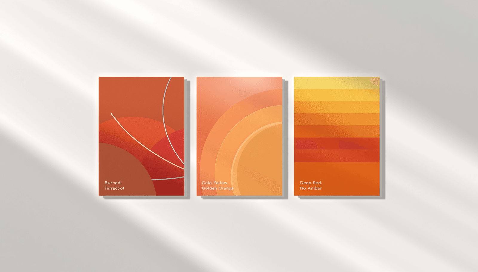
Warm color palettes are color combinations built primarily from reds, oranges, yellows, and their tonal variations such as terracotta, amber, rust, and gold. In design terms, a warm color scheme refers to any palette dominated by hues that sit on the red-to-yellow side of the color wheel, which the human eye perceives as energetic, inviting, and emotionally close.
Unlike cool tones — blues, greens, and purples — warm colors tend to advance visually, meaning they appear to come forward in a composition. This is why a small dose of orange or red in a design draws attention almost instantly.
Why Warm Colors Matter in Design
Color isn't just decoration; it's communication. Warm colors trigger specific psychological responses that designers and brands rely on constantly.
They create urgency and excitement — which is why red dominates clearance sales and call-to-action buttons.
They feel inviting and homely — terracotta and amber tones are common in hospitality and residential interiors.
They increase perceived warmth in a space — both literally and emotionally, which matters in interior design and branding alike.
They improve visual hierarchy — warm accents naturally guide the eye toward key elements.
According to color psychology research compiled by the Interaction Design Foundation, color can influence first impressions of a product or environment within 90 seconds of initial viewing, with hue playing a significant role in that judgment. That single statistic explains why brands and interior designers spend so much time choosing the right warm tone rather than picking one at random.
If you're working on a brand rather than a room, it's worth exploring how color choices shape recognition and trust in brand identity colors, since warm palettes often anchor brands that want to feel approachable rather than corporate.
Breaking Down the Warm Color Spectrum
A genuinely effective warm color palette isn't just "red plus orange plus yellow." It's a deliberate balance of tones, shades, and accents that work in proportion.
Core Hues
Reds — from deep wine and brick to vibrant scarlet, reds carry intensity and passion.
Oranges — burnt orange, terracotta, and amber sit between bold and earthy.
Yellows — from soft butter tones to bright gold, yellows add light and optimism.
Process for Building a Balanced Warm Scheme
Choose a dominant hue — typically the color that will cover the largest area (a wall, a background, a brand's primary color).
Select one or two supporting tones — these add depth without competing for attention.
Add a neutral anchor — cream, sand, or warm gray to prevent visual fatigue.
Introduce a single accent — a deeper red or gold to create contrast and focal points.
This layering process is the same one used across interior design, fashion, and digital branding, just applied to different mediums.
If you want precise control over your shades, working with color palettes with hex codes makes it far easier to replicate exact tones across packaging, websites, and print materials consistently.
Comparing Warm Color Schemes: Strengths and Trade-Offs
Aspect | Warm Color Palette Strengths | Potential Drawbacks |
Emotional impact | Feels energetic, cozy, and inviting | Can feel overwhelming in large doses |
Visual attention | Naturally draws the eye, great for CTAs | May clash if too many bright tones compete |
Space perception | Makes rooms feel smaller, warmer, intimate | Less ideal for already small or dim spaces |
Brand tone | Conveys passion, energy, friendliness | Less suited to brands wanting a calm, neutral tone |
Versatility | Works across interiors, branding, fashion | Requires careful balancing with neutrals |
This kind of side-by-side breakdown is exactly the type of structured comparison that helps when deciding whether a warm scheme fits your specific project.
Semantically Related Color Concepts Worth Knowing
Warm color palettes don't exist in isolation. They sit within a broader system of color theory that's worth understanding if you want your choices to feel intentional rather than arbitrary.
Color temperature — the warm-versus-cool spectrum that governs perceived mood.
Monochromatic warm schemes — using a single warm hue in varying shades and tints.
Analogous warm palettes — combining neighboring hues like red-orange and orange-yellow.
Complementary contrast — pairing a warm dominant color with a single cool accent for balance.
For designers who enjoy experimenting outside the warm spectrum entirely, it's worth comparing how a completely different mood is achieved through a neon color palette, which relies on saturation and brightness rather than warmth to create impact.
Practical Tips for Using Warm Color Palettes
Real-world application is where most warm palettes either succeed or fall apart. A few field-tested principles help avoid common pitfalls.
Use the 60-30-10 rule — 60% dominant warm tone, 30% supporting tone, 10% accent.
Pair warm tones with natural materials — wood, rattan, and leather amplify the cozy effect.
Test under different lighting — warm colors shift significantly under warm versus cool artificial light.
Balance with neutrals — cream, beige, and soft gray prevent visual fatigue in larger spaces.
Limit pure brights to accents — large areas of saturated red or orange can feel aggressive rather than inviting.
These principles apply whether you're styling a retail space, a hospitality interior, or a digital product where warm accent colors are used sparingly against neutral backgrounds.
Common Mistakes to Avoid
Even experienced designers fall into a few recurring traps when working with warm color schemes.
Overusing saturated tones — too much bright red or orange can read as chaotic rather than energetic.
Ignoring undertones — mixing a cool-leaning red with a warm-leaning orange can create visual friction.
Skipping neutrals entirely — an all-warm palette without breathing room quickly becomes fatiguing.
Choosing colors without context — a palette that works on screen may render differently in print or under natural light.
Treating warm tones as one-size-fits-all — what works for a restaurant brand may not suit a tech startup.
If you're still exploring style direction before committing, browsing a wider range of pretty color palettes can help clarify whether a fully warm scheme or a softer hybrid approach better fits your project.
Where Theme Palette Fits In
At Theme Palette, palette curation isn't guesswork — it's built on years of hands-on color matching across branding projects, interior mood boards, and digital design systems. The team behind Theme Palette has worked through countless warm, cool, and hybrid palette requests, which is exactly why the resource library leans heavily on precision: exact hex values, tested combinations, and real use-case context rather than generic color wheels.
This hands-on experience matters because color decisions rarely happen in a vacuum. A palette that looks perfect on a screen can shift entirely once it's printed, lit differently, or scaled across a brand's full visual system. That's the gap Theme Palette aims to close — turning color theory into something usable.
For teams and individuals who want to skip the trial-and-error phase entirely, Theme Palette offers curated, ready-to-use palette collections built specifically around these tested principles.
Conclusion
Warm color palettes built from reds, oranges, and yellows carry a unique ability to make spaces and brands feel energetic, welcoming, and alive. The key lies in balance — pairing bold hues with neutrals, respecting proportion, and understanding how undertones interact. Get that right, and a warm scheme stops feeling like a risk and starts feeling like a signature.
If you're ready to apply these principles without the guesswork, explore curated warm palette collections on Theme Palette and find the exact tones that match your next project.