
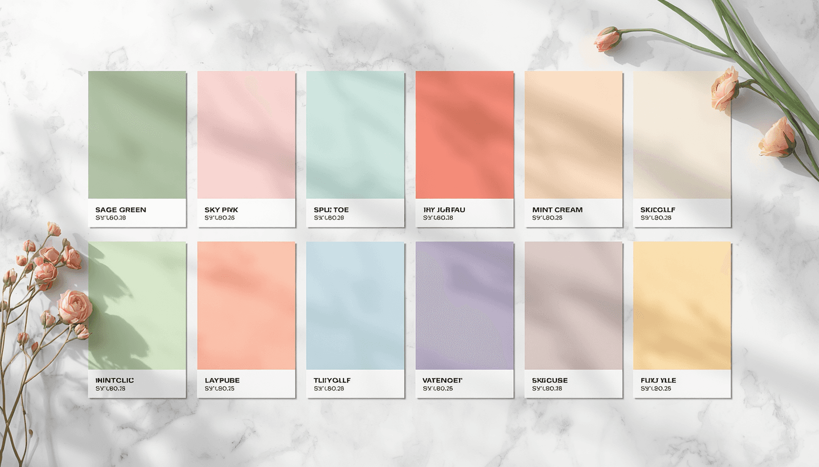
Spring color is not simply a matter of using light, bright, or floral hues. It is a specific emotional register — freshness, renewal, lightness after a period of visual heaviness — that operates through particular relationships between color temperature, saturation, and value. Designers who understand what makes spring palettes work can apply that logic precisely rather than reaching for the nearest pastel.
This guide documents the spring color palettes that are performing in design work in 2026, organized by visual character and use case. Each palette includes hex codes, the color theory logic behind it, and specific contexts where it applies. All palettes can be generated, customized, and exported at ThemePalette.
The Color Science Behind Spring Palettes
Spring color palettes are defined by three consistent structural properties:
High lightness, moderate saturation. Spring colors occupy the upper half of the lightness scale — light enough to feel airy — but retain enough saturation to read as color rather than near-white. The range is roughly 60–85% lightness and 30–60% saturation in HSL notation.
Warm-to-neutral undertones. Even spring blues and greens tend to carry warm undertones — a slight yellow shift in greens, a slight pink shift in blues — that prevent the palette from reading as cold. This warmth is what produces the sensation of sunlight without requiring actual yellow or orange hues.
Analogous or split-complementary harmony. Spring palettes rarely rely on direct complementary contrast. The dominant harmony structure is analogous — colors sitting within 60–90 degrees of each other on the color wheel — which produces the sense of coherence and naturalness associated with botanical color environments.
Research published in the Journal of Environmental Psychology (Kaya and Epps, 2004) found consistent cross-cultural associations between yellow-green and green hues and feelings of freshness, youth, and renewa.
Spring Color Palettes for 2026
1. Cherry Blossom
Petal Pink: #F7C5D0 (Primary — hero backgrounds, large surfaces)
Soft Blush: #EDA8B8 (Secondary — cards, secondary surfaces)
Moss Green: #7A9E7E (Accent — natural contrast element)
Warm White: #FDF8F5 (Surface — page background)
Deep Rose: #8C4A58 (Text — headings on light surfaces)
Cherry blossom palettes derive their effectiveness from the contrast between warm pink and natural green — a pairing that appears in nature as petals against foliage. The combination has been studied in horticultural color research as one of the most universally pleasant natural color relationships.
The key to using this palette correctly is proportion: pink should dominate large surfaces, green should appear as a grounding accent at roughly 15–20% of the visual space, and deep rose should be reserved for text and high-emphasis elements only.
2. Garden Botanical
Leaf Green: #8AB87A (Primary — brand color)
Pale Sage: #B8CDB0 (Secondary — secondary surfaces)
Soft Peach: #F4C4A0 (Accent — warm contrast)
Cream: #FAF6EC (Surface — backgrounds)
Forest: #2D5A27 (Text — headings, strong elements)
This palette is grounded in the actual color relationships found in a spring garden — the range from pale sage to deep leaf green, with warm peach as the natural counterpart to green's coolness. Unlike the cherry blossom palette, which centers on pink, this one centers on green and uses peach as an accent, producing a result that reads as botanical and fresh without being floral.
The deep forest green text color provides strong contrast against all surface and secondary colors in this palette — the combination of #2D5A27 on #FAF6EC achieves a contrast ratio of approximately 9.4:1, well above the WCAG 2.1 AA threshold of 4.5:1 for body text.
This palette applies strongly to organic food brands, garden and outdoor lifestyle content, florist businesses, and spring editorial design.
3. Pastel Spring
Lavender: #C8B8E8 (Primary — soft brand presence)
Butter Yellow: #F8E8B0 (Secondary — warm balance to lavender)
Mint: #A8D8C8 (Accent — fresh third color)
Soft White: #FDFBFF (Surface — very slightly lavender-tinted white)
Plum: #4A3060 (Text — deep contrast on light surfaces)
This is a triadic pastel palette — lavender, butter, and mint are positioned at approximately equal intervals on the color wheel, each desaturated to roughly 40% saturation and lightened to 80%+ lightness.
This combination dominates spring-themed social media content, stationery, children's product design, and lifestyle brand seasonal campaigns.
4. Floral Meadow
Wildflower Blue: #A8C4E0 (Primary — sky reference)
Meadow Green: #90B878 (Secondary — grass and stem reference)
Daisy Yellow: #F0D878 (Accent — floral focal point)
Linen: #F8F4EC (Surface — warm neutral ground)
Deep Meadow: #3A5830 (Text — dark botanical anchor)
The floral meadow palette references a specific natural environment — open field in spring — rather than a single flower type. The three main colors (blue, green, yellow) are triadic at full hue but desaturated sufficiently to read as naturalistic rather than primary. This is a more complex floral color palette than the cherry blossom version because it balances three distinct hues rather than two.
5. Spring Morning
Soft Sky: #C0D8EE (Primary — calm, expansive feel)
Warm Blush: #EEC0C8 (Secondary — gentle warmth)
Pale Lemon: #F8F0C0 (Accent — light and airy highlight)
Off White: #FAFAF8 (Surface — neutral ground)
Slate: #4A5568 (Text — cool, grounded contrast)
This palette captures the quality of light in early spring mornings — the specific combination of cool blue sky, warm pink dawn light, and pale yellow sun not yet at full intensity. All three main colors are at very high lightness (85–90%) and low-to-moderate saturation, which makes the palette feel genuinely airy rather than washed out.
The slate text color is a deliberate cool anchor — it provides contrast without the harshness of near-black and complements the blue-pink-yellow combination through tonal consistency.
This palette is suited to meditation and mindfulness apps, early morning food and coffee brands, lifestyle photography and editorial work, and premium skincare campaigns.
6. Botanical Illustration
Fern Green: #6A9E72 (Primary — primary botanical color)
Dusty Rose: #C9968A (Secondary — warm floral counterpart)
Antique Gold: #C9A84C (Accent — vintage warmth)
Aged Paper: #F2EAD8 (Surface — warm, historical ground)
Ink: #2A2A20 (Text — warm near-black)
The botanical illustration palette references the color language of 18th and 19th century scientific botanical illustration — the tradition of artists like Georg Dionysius Ehret and the Bauer brothers, whose work for institutions including the Royal Botanic Gardens at Kew established the visual conventions of plant documentation.
In 2026 design, this palette is appearing in premium lifestyle branding, independent publishing, heritage food and beverage brands, and any brand seeking to communicate craft, authenticity, and historical credibility alongside seasonal spring themes.
7. Soft Greenhouse
Glass Green: #A8C8B8 (Primary — muted, structured green)
Warm Terracotta: #C87858 (Secondary — earth anchor)
Soft Cream: #FAF4E8 (Surface — warm light)
Pale Moss: #C8D8C0 (Accent — lighter green variation)
Dark Soil: #3A2818 (Text — deep warm anchor)
The greenhouse palette draws from the specific environment of a working glasshouse — muted structural green glass, warm terracotta pots, pale light filtered through glazing, the rich dark soil of planting beds. Unlike garden-fresh palettes that emphasize lightness, this one introduces warm earth tones that give it visual weight and material credibility.
This is a stronger palette for brand identity work than for purely seasonal campaigns — it retains spring freshness through the green tones while adding year-round usability through the terracotta and dark soil anchors.
Applying Spring Palettes Across Different Design Contexts
Web Design
Spring palettes perform best in web design when the lightest palette color is used for large background surfaces and progressively deeper colors are assigned to smaller, higher-emphasis elements. Reversing this — using the most saturated spring color as the background — typically produces a result that feels overwhelming and loses the airy quality that makes spring palettes work.
Navigation elements and body text should use the darkest available color in the palette rather than introducing pure black, which creates jarring contrast against soft spring surfaces.
Social Media and Content Design
Spring seasonal campaigns perform strongly on visual platforms when the palette is applied consistently across multiple pieces rather than varying color choices post by post. A consistent spring aesthetic palette applied across six to twelve posts creates a coherent feed aesthetic that communicates intentional brand design.
Brand Identity
Spring color palettes used for brand identity should be evaluated for year-round viability. A cherry blossom palette may work well in March and April but feel seasonally misaligned by July.
Print and Packaging
Spring palettes in print require attention to color mode — the hex codes in this guide are RGB values for screen. CMYK conversion will shift colors, particularly in the yellow and green ranges where RGB gamut exceeds CMYK gamut. Work with a print supplier to proof spring palette colors before committing to a print run.
Related Palettes and Resources on ThemePalette
These guides extend spring palette exploration into adjacent seasonal and aesthetic directions:
Pretty Color Palettes — Broader collection of soft, aesthetic palettes across mood categories
Best Color Combinations — Foundational color pairings with hex codes and use cases
Trending Color Palettes 2026 — Current design directions and how spring palettes fit within them
Free Color Palette Generator — How to generate custom spring palettes from any starting hex code
Full Palette Collection — Browse and export hundreds of ready-made palettes including seasonal sets
Conclusion
Spring color palettes work because they apply a specific set of color properties — high lightness, warm undertones, analogous harmony — that consistently produce the sensory associations of renewal and freshness. Understanding the structural logic behind these palettes is more useful than collecting specific hex codes, because it allows the designer to adapt the palette precisely to whatever project context requires.
The seven palettes in this guide represent the range of spring color directions active in 2026 design — from the straightforward floral charm of cherry blossom to the material credibility of a soft greenhouse. All are available to generate, adjust, and export at ThemePalette.com.