
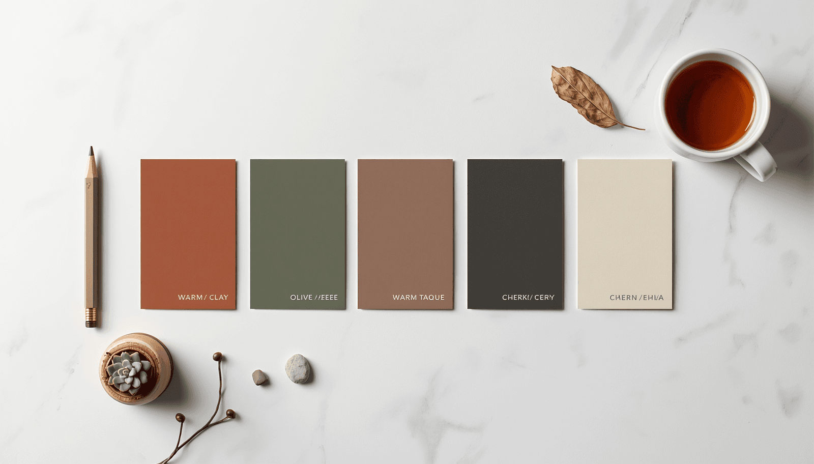
A client asked me last year to make their brand "feel less like a tech company" without changing the actual product. The fix wasn't a new logo or new copy — it was swapping a cool blue-grey palette for warm clay and olive tones. The product didn't change. The perceived warmth of the entire brand did, within a single palette revision. That's the specific power of an earth tone color palette: it shifts perceived character — warmth, honesty, groundedness — more reliably than almost any other color direction, because it borrows credibility directly from materials people already trust.
This isn't a passing aesthetic preference. Industry forecasting from multiple major paint and design authorities independently points to earth tones as the dominant direction for 2026, not a single trend call from one source. This guide covers the specific earth tone combinations backed by that forecasting data, with hex codes, real use cases, and the accessibility and production details most "natural color inspiration" content skips.
Why Earth Tones Are Dominant in 2026, Specifically
This isn't a vague seasonal preference — multiple independent color authorities are converging on the same direction with specific, named evidence.
Sherwin-Williams' HGTV Home 2026 Color Collection of the Year, called Honest Essentials, centers on organic shades like Universal Khaki and Secret Garden specifically framed around what the brand describes as a renewed respect for nature, ecological wisdom, and historical practices. The National Color Systems organization has identified wellness-focused design as one of the primary drivers behind the 2026 earth tone shift — colors selected specifically because they reduce stress and feel rooted, rather than purely for visual novelty.
The underlying explanation across these sources is consistent: a long period of cool grey and stark white minimalism — driven partly by how well that palette photographed for social media staging — has given way to a documented preference shift toward warmer, more grounded color, partly because cool high-contrast palettes are understood to produce more visual stress than warm organic tones.
Earth Tone Color Palette for 2026
1. Khaki and Sage
Universal Khaki: #B8A888
Deep Sage: #6B7A5E
Warm Cream: #F5F0E4
Charcoal Brown: #3A332A
This combination directly reflects Sherwin-Williams' Honest Essentials direction — a soft, sandy neutral paired with a deeper, muted green. Khaki here functions as a true neutral, flexible enough to sit underneath almost any accent color, while sage adds the "nature-inspired green" element that's appearing across nearly every 2026 earth tone forecast, from interior paint collections to kitchen design reports.
Best for: Wellness and lifestyle brands, sustainable product packaging, organic food brands.
2. Terracotta and Olive
Terracotta: #C4623A
Olive: #6B6B3A
Warm Sand: #E8D8B8
Espresso: #3A2818
Olive and fir green are specifically called out as among the colors dominating 2026 interior design, often carrying purplish or grey undertones that make them more versatile than the flatter earth tones of previous design cycles. Paired with terracotta — a color with deep roots in pottery, brick, and clay craftsmanship — this combination carries genuine material credibility rather than feeling like an applied aesthetic.
Best for: Artisan and craft brands, ceramics and home goods, independent food and beverage.
3. Mineral Neutral and Oxide Red
Mineral Grey: #9B9388
Oxide Red: #A8442E
Stone White: #EDE8DC
Deep Umber: #2E2418
Forest greens, mineral neutrals, and oxide reds are specifically identified in 2026 interior wall finish trend reporting as the core of the year's earthy direction, with oxide red in particular referencing natural iron-oxide pigments used in traditional plaster and ceramic finishes for centuries. This is one of the more sophisticated earth tone combinations precisely because oxide red carries historical and material weight that a simple "warm red" doesn't.
Best for: Architecture and interior design firms, heritage brands, premium ceramics and ceramics-adjacent products.
4. Chocolate Brown and Mushroom Taupe
Chocolate Brown: #4A3424
Mushroom Taupe: #B8A898
Oatmeal: #E8DFCE
Off-Black: #2A2420
Deep chocolate browns paired with mushroom taupe and oatmeal are central to the "organic modern" 2026 interior direction — a style built specifically around muted, matte tones that feel aged, sun-washed, and naturally occurring rather than manufactured. The deliberate avoidance of anything glossy or stark is part of the palette's identity: every color here should read as if it could plausibly have come from an actual natural material — clay, stone, driftwood, wool.
Best for: Premium lifestyle and home goods brands, minimalist editorial design, slow-living and craft content.
5. Forest Green and Burgundy
Forest Green: #2D4A2E
Burgundy: #6B2438
Stone Beige: #D8C8B0
Near Black: #1A1612
Forest green paired with deep burgundy reflects the layered, richer end of the 2026 earth tone direction — moving past the lighter sage-and-cream combinations into a more saturated, traditionally "luxury interior" register. This pairing is referenced specifically in 2026 wall finish and color-of-the-year reporting from multiple paint authorities as part of a broader move toward depth and tactile elegance over flat, uniform color application.
Best for: Premium hospitality and restaurant branding, publishing and heritage brands, luxury product packaging.
A Production Detail Most Earth Tone Guides Skip
A genuinely useful insight from current design forecasting that almost never appears in color-only content: color saturation in earth tone palettes is frequently conveyed through texture rather than pigment intensity alone. A rough, unglazed ceramic tile in a pale clay color reads as more vibrant and "on trend" than a glossy, perfectly smooth paint finish in the exact same hex value.
For brand and web design specifically, this means earth tone palettes often benefit from pairing with grain textures, matte photography treatment, or subtle noise overlays — not just the correct hex codes in isolation.
Accessibility: Earth Tones and Contrast
Earth tone palettes generally perform well on accessibility because most combinations naturally include sufficient lightness variation — a deep umber or espresso brown against a warm cream or oatmeal background typically clears the WCAG 2.1 minimum contrast ratio of 4.5:1 for normal text comfortably. The combinations most likely to fail are mid-tone pairings — mushroom taupe directly against mineral grey, for instance — where both colors sit in a similar middle lightness range. Always pair your darkest available color with your lightest for actual body text, reserving mid-tone combinations for larger display text or decorative use.
Check contrast for any earth tone pairing intended for text at ThemePalette's generator, which displays ratios during palette creation rather than as a separate audit step.
How Earth Tones Compare to Other 2026 Directions
If a brief calls for something brighter or more energetic than earth tones can deliver, the vibrant color combinations guide covers the opposite end of the 2026 spectrum — useful to review side by side when a client's brief is ambiguous about how warm versus bold the final direction should land. For a broader view of where earth tones sit within this year's full design landscape, Trending Color Palettes 2026 covers additional directions beyond the earthy and natural focus of this guide. And if the project needs softer, more pastel natural tones rather than the deeper, richer earth palette covered here, Pretty Color Palettes includes several lighter nature-adjacent combinations worth comparing.
Conclusion
An earth tone color palette in 2026 isn't a single trend call — it's a direction independently confirmed across major paint, interior, and kitchen design authorities, all pointing toward the same underlying shift: warmth, material honesty, and grounded color over the cool, manufactured uniformity that defined the previous design cycle. The combinations in this guide reflect real forecasting data, not just a visually pleasant moodboard.
Build and test your own earth tone palette at ThemePalette.com.